Tabs
Updated May 05, 2025 ·
Changing heading colors
Create the CSS file. You can customize the color and labels.
styles.modulus.css
/* Default text color for all tabs */
.tab-label {
    color: black;
  }


  .red {
    /* Default text color for unselected tab */
    color: black;
  }

  .red[aria-selected='true'] {
    /* Background color for selected tab */
    background-color: #ff8686;
    /* Text color for selected tab */
    color: black;
  }


  .yellow {
    /* Default text color for unselected tab */
    color: black;
  }

  .yellow[aria-selected='true'] {
    /* Background color for selected tab */
    background-color: #fed871;
    /* Text color for selected tab */
    color: black;
  }


  .gray {
    /* Default text color for unselected tab */
    color: black;
  }

  .gray[aria-selected='true'] {
    /* Background color for selected tab */
    background-color: #d3d3d3;
    /* Text color for selected tab */
    color: black;
  }
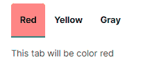
In your markdown file, add the following code. You can customize the texts inside each tab.
filename.md
import Tabs from '@theme/Tabs';
import TabItem from '@theme/TabItem';
import styles from '../../../src/css/styles.module.css';

<Tabs>
  <TabItem value="Red" label="Red" attributes={{className: `${styles.red} ${styles['tab-label']}`}}>
    This tab will be color red
  </TabItem>
  <TabItem value="Yellow" label="Yellow" attributes={{className: `${styles.yellow} ${styles['tab-label']}`}}>
    This tab will be color yellow
  </TabItem>
  <TabItem value="Gray" label="Gray" attributes={{className: `${styles.gray} ${styles['tab-label']}`}}>
    This tab will be color gray
  </TabItem>
</Tabs>
Build and deploy. It should look like this:
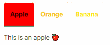
Changing label and heading colors
Modifying the CSS file and markdown files from the previous section:
styles.modulus.css
/* Default text color for all tabs */
.tab-label {
  color: black;
}

.red {
  /* Default text color for unselected tab */
  color: red;
}

.red[aria-selected='true'] {
  /* Background color for selected tab */
  background-color: red;
  /* Text color for selected tab */
  color: black;
}

.orange {
  /* Default text color for unselected tab */
  color: orange;
}

.orange[aria-selected='true'] {
  /* Background color for selected tab */
  background-color: orange;
  /* Text color for selected tab */
  color: black;
}

.yellow {
  /* Default text color for unselected tab */
  color: yellow;
}

.yellow[aria-selected='true'] {
  /* Background color for selected tab */
  background-color: yellow;
  /* Text color for selected tab */
  color: black;
}
filename.md
import Tabs from '@theme/Tabs';
import TabItem from '@theme/TabItem';
import styles from '../../../src/css/styles.module.css';

<Tabs>
  <TabItem value="apple" label="Apple" attributes={{className: `${styles.red} ${styles['tab-label']}`}}>
    This is an apple 🍎
  </TabItem>
  <TabItem value="orange" label="Orange" attributes={{className: `${styles.orange} ${styles['tab-label']}`}}>
    This is an orange 🍊
  </TabItem>
  <TabItem value="banana" label="Banana" attributes={{className: `${styles.yellow} ${styles['tab-label']}`}}>
    This is a banana 🍌
  </TabItem>
</Tabs>
Build and deploy. It should look like this: