Bootstrap Grid
Updated Mar 20, 2019 ·
Overview
Bootstrap's grid system makes it easy to create responsive layouts for your website. It helps you organize content into columns and adjust the layout depending on the screen size.
- Bootstrap uses a 12-column grid.
- Columns adjust automatically based on screen size (small, medium, large, extra-large).
- You can combine columns to create custom layouts.
Grid Layout
Below is a basic Bootstrap grid layout:
  <div class="container text-center">
    <div class="row">
      <div class="col col-sm-6"> 1 of 3 /div>
      <div class="col col-sm-3"> 2 of 3 </div>
      <div class="col col-sm-3"> 3 of 3 </div>
    </div>
  </div>
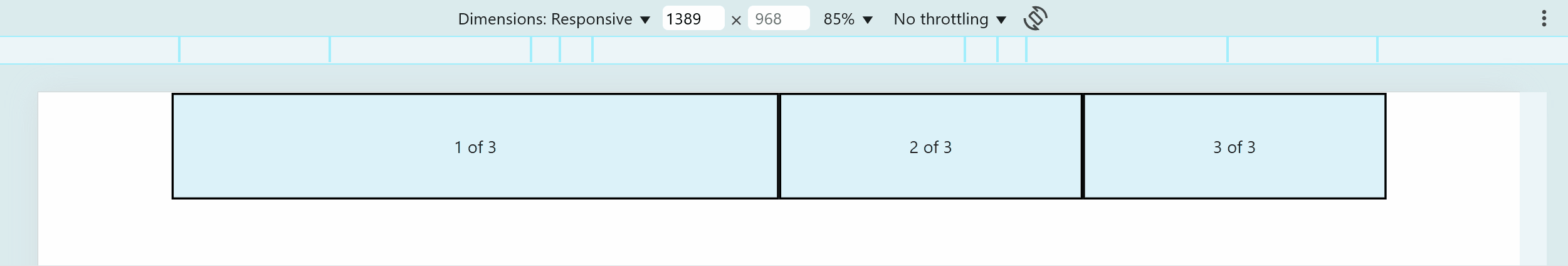
How it works:
- Bootstrap’s grid system has 12 columns in total.
- Column 1 takes up 6 spaces, while Columns 2 and 3 take 3 spaces each.
- The total adds up to 12 columns
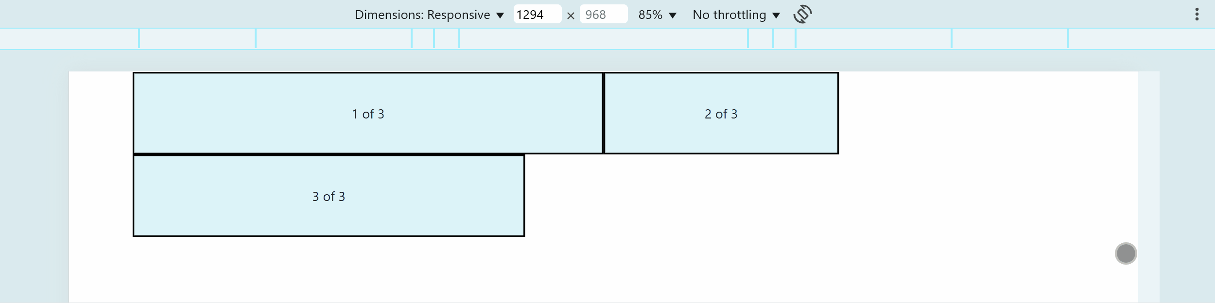
Here's how it looks like:
See sample file shere: Github
If the total column spaces exceed 12, the extra columns move to the next row.
  <div class="container text-center">
    <div class="row">
      <div class="col col-sm-6"> 1 of 3 </div>
      <div class="col col-sm-3"> 2 of 3 </div>
      <div class="col col-sm-5"> 3 of 3 </div>
    </div>
  </div>
Here's how it looks like:
Responsive Grid
Bootstrap adjusts columns based on screen size. You can specify how columns behave on different devices.
Example with different grid sizes:
  <div class="container text-center">
    <div class="row">
      <div class="col col-12 col-sm-6 col-md-12 col-lg-4"> 1 of 3 </div>
      <div class="col col-12 col-sm-3 col-md-6 col-lg-4"> 2 of 3 </div>
      <div class="col col-12 col-sm-5 col-md-6 col-lg-4"> 3 of 3 </div>
    </div>
  </div>
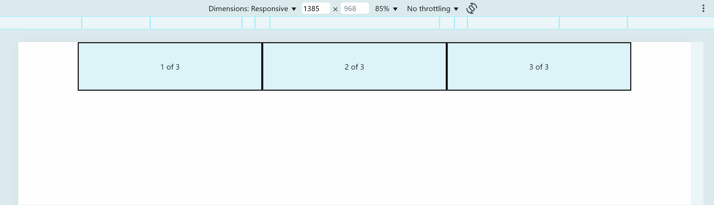
How the layout works:
- Extra small screens (
col-12) – Each column takes up the full width, stacking in separate rows. - Small screens (
col-sm-) – First two columns share a row, while the third moves to the next row. - Medium screens (
col-md-) – The first column takes a full row, while the second and third share the next row. - Large screens (
col-lg-) – Columns are evenly divided into three equal parts.
Here's how it looks like:
See sample file shere: Github
For more information, please see Grid options