Bootstrap Navs-tabs
Overview
Navs and Tabs can be used to style navigation menus. They are especially useful when you have multiple content sections but want to display only one section at a time while hiding the others.
- Allow toggling between different content panes
- Only one pane is visible at any given time
- Useful for organizing information in limited space
- Reduces clutter by avoiding long scrollable pages
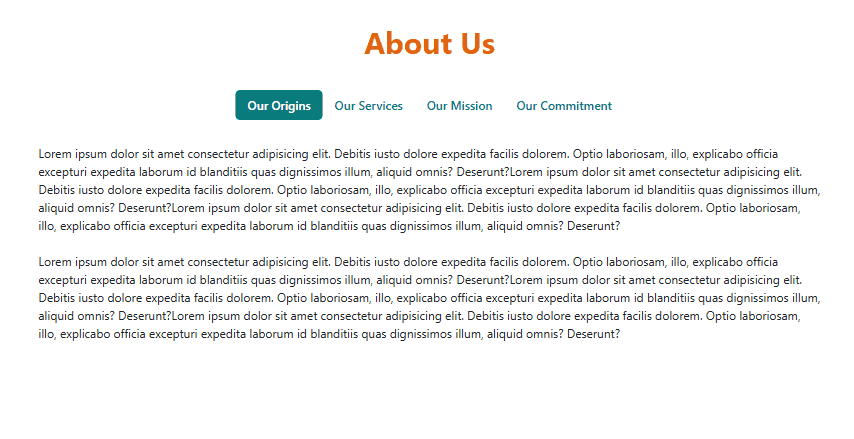
Example:
Bootstrap provides official documentation for Navs and Tabs that you can refer to for implementation.
This guide focuses on how to style them.
Sticky Tab Bar
Sometimes when you click a tab, the content changes correctly but the page also scrolls down. This can hide part or all of the tab bar.
See sample code here
<div class="container about-container" id="about-container">

    <!-- Tabs Navigation -->
    <ul class="nav nav-pills"
        id="aboutTabs" role="tablist">
      <li class="nav-item" role="presentation">
        <a class="nav-link" id="origin-tab"
            aria-controls="origin" aria-selected="false"role="tab" tabindex="-1"
            data-bs-toggle="pill" data-bs-target="#origin">
           Our Origins
        </a>
      </li>
      <li class="nav-item" role="presentation">
        <a class="nav-link" id="services-tab"
            aria-controls="services" aria-selected="false" role="tab" tabindex="-1"
            data-bs-toggle="pill" data-bs-target="#services">
            Our Services
        </a>
      </li>
      <li class="nav-item" role="presentation">
        <a class="nav-link" id="mission-tab"
            aria-controls="mission" aria-selected="false" role="tab" tabindex="-1"
            data-bs-toggle="pill" data-bs-target="#mission">
            Our Mission
        </a>
      </li>
      <li class="nav-item" role="presentation">
        <a class="nav-link active" id="commitment-tab"
            aria-controls="commitment" aria-selected="true"role="tab" tabindex="-1"
            data-bs-toggle="pill" data-bs-target="#commitment">
            Our Commitment
        </a>
      </li>
    </ul>

    <!-- Tabs Content -->
    <div class="tab-content" id="aboutTabsContent">
      <div class="tab-pane fade" id="origin"
            role="tabpanel" aria-labelledby="origin-tab">
        <h3>Our Origins</h3>
        <p>Lorem ipsum dolor sit amet.........
        </p>
      </div>
      <div class="tab-pane fade" id="services"
            role="tabpanel" aria-labelledby="services-tab">
        <h3>Our Services</h3>
        <p>Lorem ipsum dolor sit amet.........
        </p>
      </div>
      <div class="tab-pane fade" id="mission"
            role="tabpanel" aria-labelledby="mission-tab">
        <h3>Our Mission</h3>
        <p>Lorem ipsum dolor sit amet.........
        </p>
      </div>
      <div class="tab-pane fade active show" id="commitment"
            role="tabpanel" aria-labelledby="commitment-tab">
        <h3>Our Commitment</h3>
        <p>Lorem ipsum dolor sit amet.........
        </p>
      </div>
    </div>

</div>

This happens because Bootstrap’s nav-pills with data-bs-toggle="pill" will scroll into view the selected .tab-pane, and if that content is long, it pushes the tabs off the screen, especially on smaller devices.
<!-- Tabs Navigation -->
<ul class="nav nav-pills"
    id="aboutTabs" role="tablist">

  <li class="nav-item" role="presentation">
    <a class="nav-link" id="origin-tab"
        data-bs-toggle="pill" data-bs-target="#origin">
        Our Origins
    </a>
  </li>
Option 1: Make the Tabs Sticky
You can make the navtabs stick to the top of the section when scrolling, by using position: sticky.
.nav-pills {
  position: sticky;
}
Note that this only ensures that the tab bar is always in view, but it doesn't prevent the auto-scrolling behavior. To do this, please see Prevent Auto-scrolling, Just Toggle Panels.
Option 2: Scroll to Top of Section on Click
Another approach: use a little JS to scroll the view back to the top of the section when a tab is clicked, keeping the tabs in view:
Add the JavaScript code to your HTML:
<script>
  document.querySelectorAll('#aboutTabs .nav-link').forEach(link => {
    link.addEventListener('click', () => {
      document.getElementById('about-container').scrollIntoView({ behavior: 'smooth' });
    });
  });
</script>
This makes the section (with the tabs) scroll back into view when any tab is clicked. This is useful if you're not doing sticky tabs, and just want to ensure the nav is visible after clicking.
Option 3: Scroll Target Adjustment (Optional + Extra Polish)
Sometimes clicking a tab will scroll too far (especially on mobile). You can add padding-top to your tab content and negative margin-top to offset this:
.tab-content > .tab-pane {
  scroll-margin-top: 80px; /* adjusts scroll behavior on tab click */
}
Optional: Add Top Padding to Tab Content
Add some padding-top to your tab content area to create space below the sticky tabs:
.tab-content {
  padding-top: 60px; /* adjust based on sticky nav height */
}
This ensures there's enough space above the content so it's not hidden behind the sticky tabs.
Prevent Auto-scrolling, Just Toggle Panels
Bootstrap 5 triggers scrolling by default when it activates a tab (changing tabs), but you can the scroll jump entirely so it only swaps the content without moving the page at all.
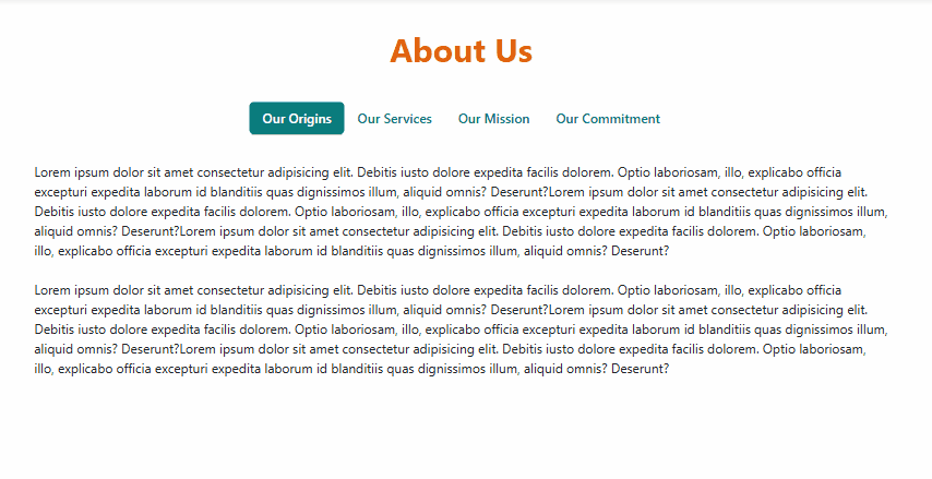
See sample code here
<div class="container about-container" id="about-container">

    <!-- Tabs Navigation -->
    <ul class="nav nav-pills"
        id="aboutTabs" role="tablist">
      <li class="nav-item" role="presentation">
        <a class="nav-link" id="origin-tab"
            aria-controls="origin" aria-selected="false"role="tab" tabindex="-1"
            data-bs-toggle="pill" data-bs-target="#origin">
           Our Origins
        </a>
      </li>
      <li class="nav-item" role="presentation">
        <a class="nav-link" id="services-tab"
            aria-controls="services" aria-selected="false" role="tab" tabindex="-1"
            data-bs-toggle="pill" data-bs-target="#services">
            Our Services
        </a>
      </li>
      <li class="nav-item" role="presentation">
        <a class="nav-link" id="mission-tab"
            aria-controls="mission" aria-selected="false" role="tab" tabindex="-1"
            data-bs-toggle="pill" data-bs-target="#mission">
            Our Mission
        </a>
      </li>
      <li class="nav-item" role="presentation">
        <a class="nav-link active" id="commitment-tab"
            aria-controls="commitment" aria-selected="true"role="tab" tabindex="-1"
            data-bs-toggle="pill" data-bs-target="#commitment">
            Our Commitment
        </a>
      </li>
    </ul>

    <!-- Tabs Content -->
    <div class="tab-content" id="aboutTabsContent">
      <div class="tab-pane fade" id="origin"
            role="tabpanel" aria-labelledby="origin-tab">
        <h3>Our Origins</h3>
        <p>Lorem ipsum dolor sit amet.........
        </p>
      </div>
      <div class="tab-pane fade" id="services"
            role="tabpanel" aria-labelledby="services-tab">
        <h3>Our Services</h3>
        <p>Lorem ipsum dolor sit amet.........
        </p>
      </div>
      <div class="tab-pane fade" id="mission"
            role="tabpanel" aria-labelledby="mission-tab">
        <h3>Our Mission</h3>
        <p>Lorem ipsum dolor sit amet.........
        </p>
      </div>
      <div class="tab-pane fade active show" id="commitment"
            role="tabpanel" aria-labelledby="commitment-tab">
        <h3>Our Commitment</h3>
        <p>Lorem ipsum dolor sit amet.........
        </p>
      </div>
    </div>

</div>
Override Default Scroll
Bootstrap scrolls because the href with a # (e.g. href="#origin") makes the browser try to scroll to that id. That behavior happens even before JavaScript has a chance to override it. To solve this, change tab links to use data-bs-target instead of href
Replace this:
<a class="nav-link"
   id="origin-tab"
   data-bs-toggle="pill"
   href="#origin"
   role="tab"
   aria-controls="origin"
   aria-selected="true">
   Our Origins
</a>
With this:
<a class="nav-link"
   id="origin-tab"
   data-bs-toggle="pill"
   data-bs-target="#origin"
   role="tab"
   aria-controls="origin"
   aria-selected="true">
   Our Origins
</a>
This completely disables Bootstrap's scroll-jump behavior, because you're no longer triggering a native anchor scroll.
Using data-bs-target is fully supported by Bootstrap 5 and works the same way as href="#...". The difference is it prevents the page from scrolling when switching tabs.
Optional: Prevent scroll restoration via hash
If users are landing on your page via example.com/about#services, the browser will scroll to #services. If you want to disable even that:
<script>
  history.scrollRestoration = 'manual';
</script>
Or clear the hash:
window.history.replaceState(null, "", window.location.pathname);