Matplotlib
Overview
Data visualization is a key part of data analysis. It helps you explore datasets, extract insights, and share findings effectively.
- Helps you understand data better.
- Makes sharing insights with others easier.
Using Matplotlib
Matplotlib is the foundation of Python's visualization libraries. Its pyplot subpackage is essential.
- Import
pyplotasplt. - Use
plt.plot()to create a plot. - Use
plt.show()to display it.
Example: World Population Growth
- Use a
yearlist for years (e.g., 1970). - Use a
poplist for populations (e.g., 3.7 billion). - Pass
yearandpoptoplt.plot()to create a line chart. - Call
plt.show()to display the chart.
Implementing it
import matplotlib.pyplot as plt
year = [1970, 1980, 1990, 2000, 2010, 2020]
pop = [3.7, 4.4, 5.3, 6.1, 6.9, 7.8]

plt.plot(year, pop)
plt.show()
Note: The plt.plot() sets up the chartm while plt.show() displays it. Add titles and labels before calling plt.show().
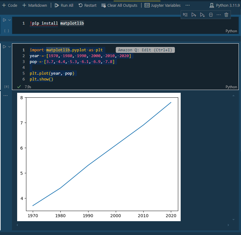
Running in VS Code
Code can be viewed here: 001-sample_matplotlib.ipynb
If you are using Visual Studio Code, you must first do the following:
- Install the Jupyter Notebook extension
- Install Python in VS Code
- Click
Ctrl + Shift + rto create a Python notebook.
Before anything else, make sure to choose your kernel.
In the notebook, add the following in the first cell:
!pip install matplotlib
In the second cell, add this:
import matplotlib.pyplot as plt
year = [1970, 1980, 1990, 2000, 2010, 2020]
pop = [3.7, 4.4, 5.3, 6.1, 6.9, 7.8]

plt.plot(year, pop)
plt.show()
Click Run All to run the cells. It will go through each cell, installing the matplotlib library first, before running the code in the second cell. The result should be the plotted values.
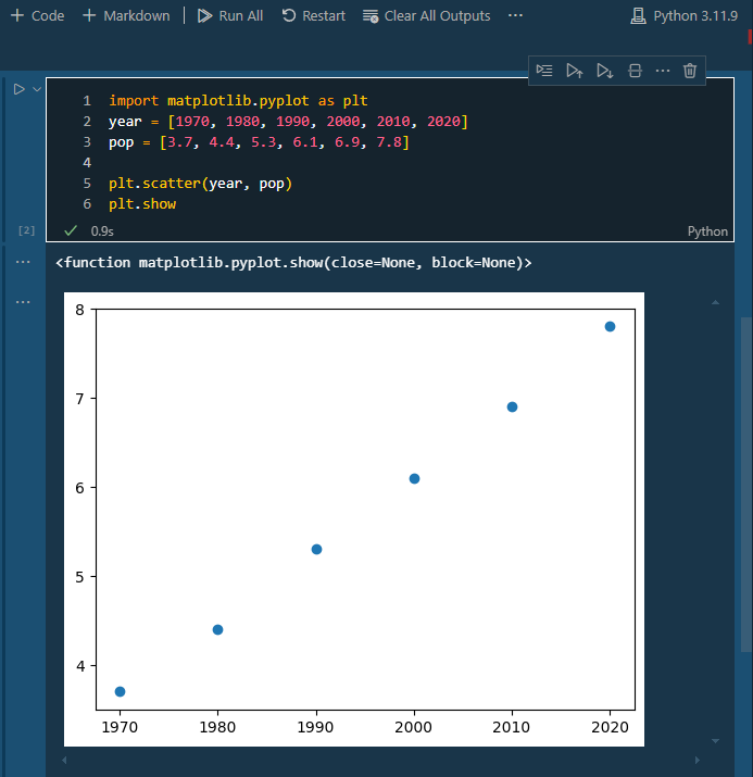
Scatter Plot
When you have a time scale along the horizontal axis, the line plot is useful. But in many other cases, when you're trying to assess if there's a correlation between two variables, for example, the scatter plot is the better choice.
Using the previous example:
import matplotlib.pyplot as plt
year = [1970, 1980, 1990, 2000, 2010, 2020]
pop = [3.7, 4.4, 5.3, 6.1, 6.9, 7.8]

plt.scatter(year, pop)
plt.show
Output:
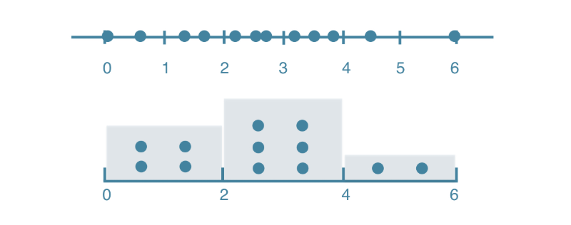
Histograms
Histograms are a great way to explore data distributions. They divide data into equal-sized chunks, called bins, and show how many data points fall into each bin. This provides a clear picture of the distribution.
How a Histogram Works:
-
Imagine 12 values between 0 and 6.
data = [0.5, 1.0, 1.8, 1.9, 2.5, 2.9, 3.2, 3.8, 4.1, 4.7, 5.5, 5.9] -
Split the number line into equal chunks (bins). For example, 3 bins of width 2:
- Bin 1: 0–2
- Bin 2: 2–4
- Bin 3: 4–6
-
Next, count the data points in each bins:
- Bin 1: 4 points
- Bin 2: 6 points
- Bin 3: 2 points
-
Each bin gets a bar whose height corresponds to the count of points in that bin.
Create Histograms in Matplotlib
You can use Matplotlib's pyplot.hist() function to create histograms. Consider the example below:
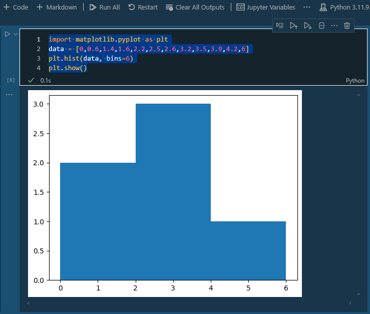
import matplotlib.pyplot as plt
data = [0,0.6,1.4,1.6,2.2,2.5,2.6,3.2,3.5,3.9,4.2,6]
plt.hist(data, bins=6)
plt.show()
Key arguments in the plt.hist:
x: The data to plot.bins: Number of bins (default is 10).
Output:
Customizing the Plot
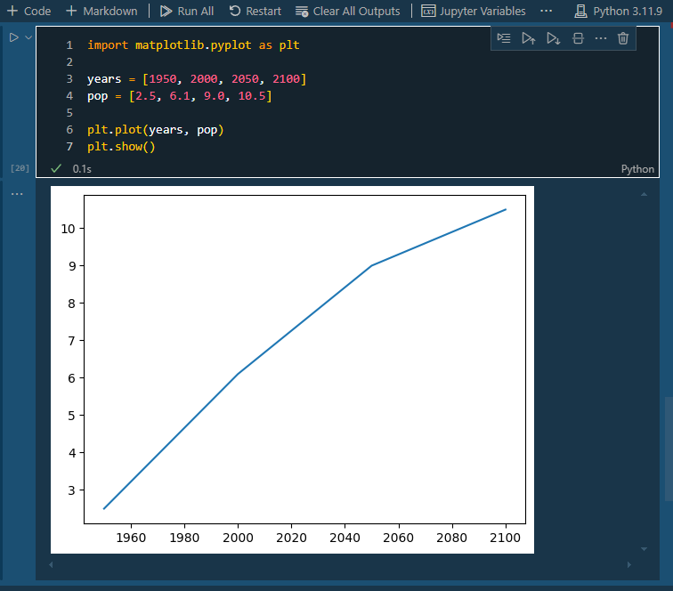
Customizing plots involves adjusting elements like colors, shapes, and labels, depending on the data and the story you want to tell. Although line plots are informative, we can enhance them by adding labels and a clearer focus on the population explosion. Consider the example below:
import matplotlib.pyplot as plt

years = [1950, 2000, 2050, 2100]
pop = [2.5, 6.1, 9.0, 10.5]

plt.plot(years, pop)
plt.show()
Output:
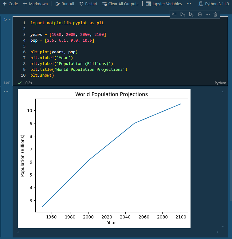
Labels
To customize this, you can add axis labels using xlabel and ylabel. This step helps people quickly understand what the axes represent.
import matplotlib.pyplot as plt

years = [1950, 2000, 2050, 2100]
pop = [2.5, 6.1, 9.0, 10.5]

plt.plot(years, pop)
plt.xlabel('Year')
plt.ylabel('Population (Billions)')
plt.title('World Population Projections')
plt.show()
Output:
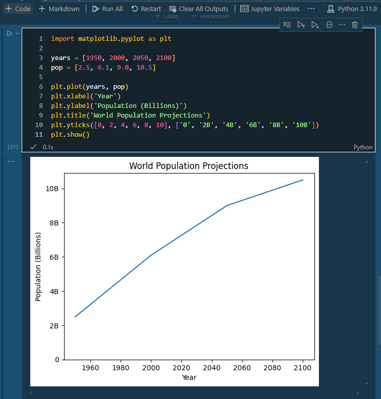
Axis Ticks
After adding labels, you can also adjust the y-axis ticks for clarity, ensuring they reflect billions by modifying tick names.
import matplotlib.pyplot as plt

years = [1950, 2000, 2050, 2100]
pop = [2.5, 6.1, 9.0, 10.5]

plt.plot(years, pop)
plt.xlabel('Year')
plt.ylabel('Population (Billions)')
plt.title('World Population Projections')
plt.yticks([0, 2, 4, 6, 8, 10], ['0', '2B', '4B', '6B', '8B', '10B'])
plt.show()
Output:
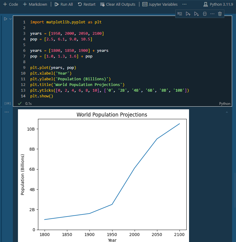
Adding Data points
To provide a fuller picture of population trends, you can also add historical data points (e.g., years 1800, 1850, 1900) and append them to the existing lists. This creates a more comprehensive visual representation of the population explosion over time.
import matplotlib.pyplot as plt

years = [1950, 2000, 2050, 2100]
pop = [2.5, 6.1, 9.0, 10.5]

years = [1800, 1850, 1900] + years
pop = [1.0, 1.3, 1.6] + pop

plt.plot(years, pop)
plt.xlabel('Year')
plt.ylabel('Population (Billions)')
plt.title('World Population Projections')
plt.yticks([0, 2, 4, 6, 8, 10], ['0', '2B', '4B', '6B', '8B', '10B'])
plt.show()
Output: