Advanced CSS
Overview
The critical render path is how a website loads and displays content in a browser.
How It Works
-
Requesting the HTML
The browser requests the website’s HTML file from a server. -
Processing the HTML
As the browser reads the HTML, it finds references to other resources like CSS and fonts. -
Fetching CSS and Fonts
The browser requests the CSS file and waits for it before rendering the page. If font files are needed, it also fetches them. -
Rendering the Page
The browser processes the HTML and CSS to display the website. If fonts are still loading, text may not appear properly.
Optimizing Load Speed
-
Use Local Fonts
Instead of fetching fonts from external sources, host them locally to reduce load time. -
Minify CSS
Remove unnecessary spaces and line breaks to reduce file size and speed up loading.
Minified CSS
Original CSS:
body {
    background-color: white;
    font-size: 16px;
    color: black;
}
Minified CSS:
body{background-color:white;font-size:16px;color:black;}
Minification reduces file size, which makes pages load faster.
See: Minify-CSS
Responsive Design
Websites need to look good on all devices, from desktops to phones. Responsive design helps adjust layouts based on screen size.
-
Fluid Layouts
Use percentages instead of fixed widths to make elements adjust to different screen sizes.
.container {width: 80%;} -
Media Queries
Apply styles based on screen width.
@media (max-width: 600px) {body {background-color: lightgray;}} -
Flexible Images
Ensure images resize with the screen.
img {max-width: 100%;height: auto;} -
Viewport Meta Tag
Helps the browser scale content properly.
<meta name="viewport" content="width=device-width, initial-scale=1">
Example
A responsive card layout using CSS Grid and media queries.
.card-container {
  display: grid;
  grid-template-columns: repeat(auto-fit, minmax(200px, 1fr));
  gap: 16px;
}

.card {
  padding: 20px;
  background: #f4f4f4;
}
Button Hover Effect
Modifying the button’s hover state improves user interaction.
- Change background color when hovered
- Adjust border color for consistency
- Increase border width for better emphasis
Apply a hover effect in CSS:
.btn-primary:hover {
    background-color: #ee4b08;
    border-color: #ee4b08;
    border-width: 4px;
}
Media Queries
Media queries help adjust the design of a website based on the screen size.
- Media queries change styles based on screen width
- They improve the design for different devices
- Ensures the website looks good on phones, tablets, etc
To use a media query, write the @media rule with conditions for the screen size.
Example: Change the navigation menu's font size on smaller screens:
@media only screen and (max-width: 600px) {
  .main-nav {
    font-size: 14px;
    padding: 0;
  }
}
This rule makes the font size smaller and removes padding when the screen is 600px or smaller. When the screen size increases, the default styles are used again.
Viewport Height (vh)
Viewport height (vh) helps elements adjust based on the height of the browser window.
vhmakes elements responsive to window size changes100vhmakes an element fill the entire screen height- Use
50vhfor an element to take up half the screen height
Example:
.container {
  height: 50vh;
}
The element's height will adjust as the window size changes. With 50vh, the container will always take up 50% of the page height.
If set to 100vh, the container will always fill the entire page, regardless of the screen size.
Setting Dark Mode
To enable Bootstrap's dark mode, just add the data-bs-theme="dark" attribute to your <html> tag like this:
<!DOCTYPE html>
<html lang="en" data-bs-theme="dark">
This will apply Bootstrap's dark styling throughout your page.
Pesticide Extension in Chrome
Pesticide is a browser extension that helps visualize CSS layout by outlining elements with colored borders.
- To download Pesticide, go to the Chrome Web Store.
- install the plugin to Google Chrome.
- You can also pin it to your toolbar for easy access
Using Pesticide to view the CSS boxes for troubleshooting:
If it doesn't work, you may need to change your Chrome permissions:
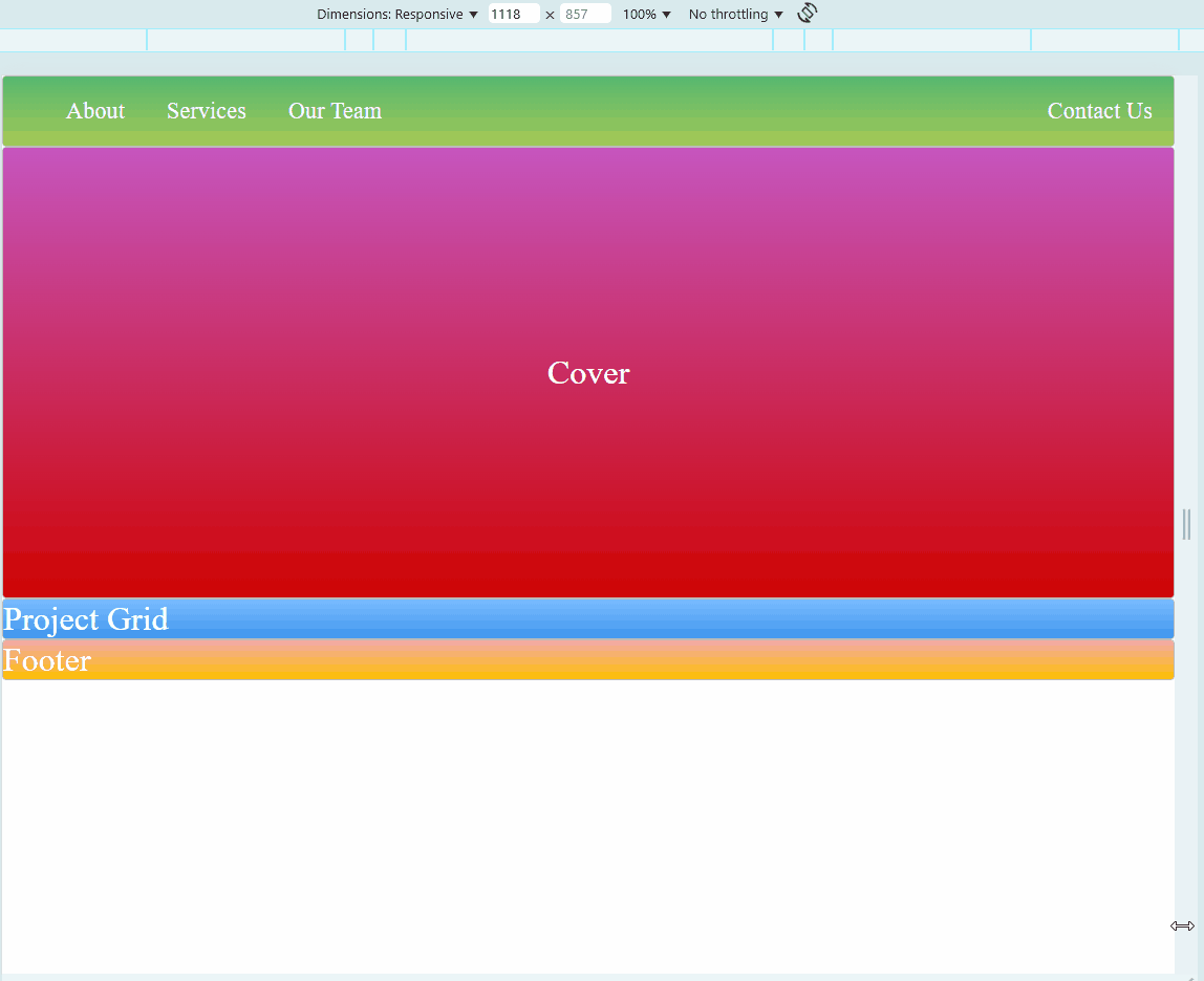
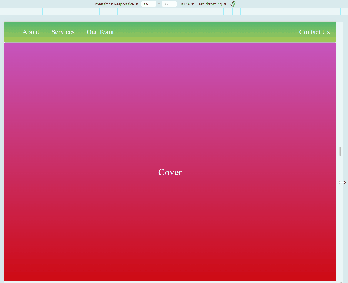
Sample Website
Below is a sample HTML page. Try to hover on each photos. You may also adjust the size of your browser to see if the embedded website also changes.