Dropdown Menus
Cannot Modify Style
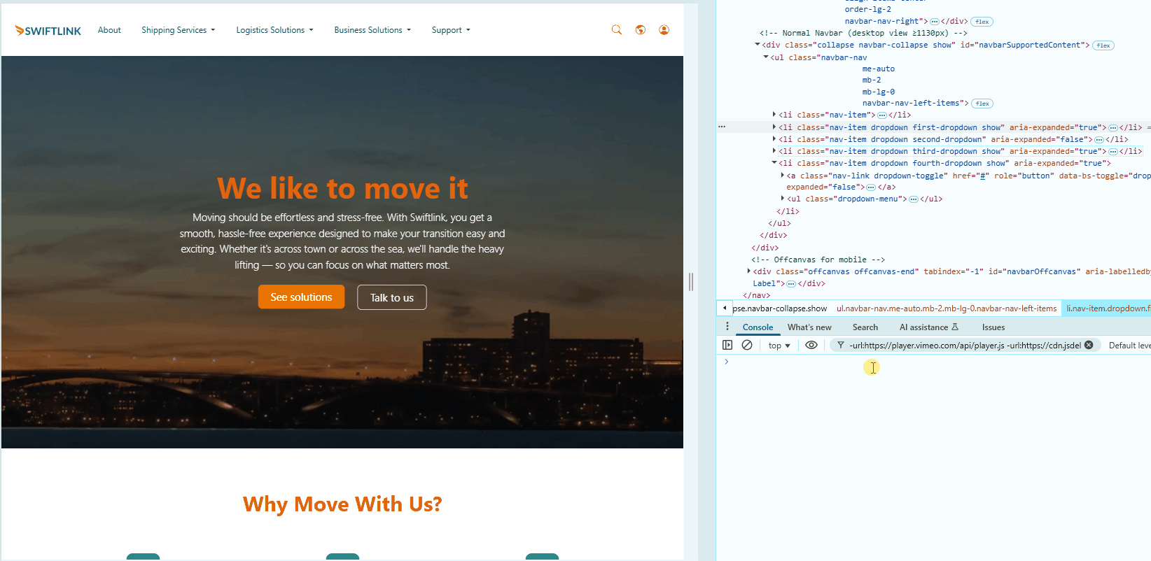
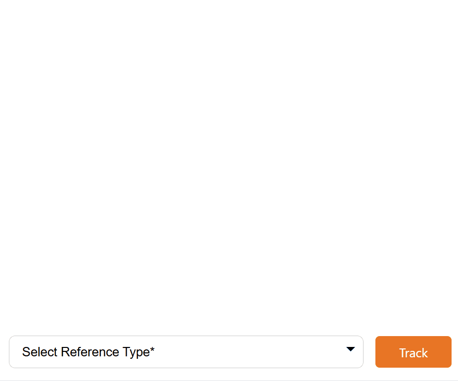
I encountered this when I was trying to modify the text color and background color when I hover on items in a dropdown bar. By default, it shows a blue background.
I learned that there are some browser limitations when it comes to using dropdown menus. Most browsers do not allow styling <option> hover states due to native rendering of dropdowns.
/* This tries to change background color, but this will fgil. */
#referenceDropdown option:checked {
  background-color: blue;            /* Background */
  color: red;                        /* Text color of selected option */
}
Reason
Browsers like Chrome and Firefox don't expose hover or active states of <option> elements to custom CSS because of accessibility and security reasons.
#referenceDropdown option:hover {   /* ❌ This won't work in most browsers */
  background-color: blue;
  color: red;
}
This is the reason why I still see blue background with white text when hovering over dropdown options. It's the default browser behavior and cannot be overridden with plain CSS.
Workaround: Change Overall Styling
Change overall <select> styling instead:
#referenceDropdown:hover,
#referenceDropdown:focus {
  background-color: white;
  color: #333;
  border-color: red;
  box-shadow: none;
}
This affects the entire dropdown control, not the options inside it.
Workaround: Use JavaScript
To fully control styles like hover, highlight color, icons, font size, and behavior, you need a JS-based solution. Recommended:
- Choices.js - lightweight & customizable
- Select2 - popular jQuery-based
- Bootstrap Select - for Bootstrap projects
These libraries replace the native <select> with a stylable version using custom HTML elements.
Workaround: Choices.js (DID NOT WORKED)
Attempted to do this but did not worked. Use custom logic through JS script, and also through playing around the HTML layout, as well as the CSS rulesets.
For reference, please see Custom Select Box.
Example: Using Choices.js
- Include Choices.js in your page (via CDN or npm).
- Initialize it in your JS:
<link rel="stylesheet" href="https://cdn.jsdelivr.net/npm/choices.js/public/assets/styles/choices.min.css">
<script src="https://cdn.jsdelivr.net/npm/choices.js/public/assets/scripts/choices.min.js"></script>


<script>
  document.addEventListener('DOMContentLoaded', function () {
    new Choices('#referenceDropdown', {
      searchEnabled: false
    });
  });
</script>
Now you can target dropdown items like:
.choices__item--selectable:hover {
  background-color: #f5f5f5;
  color: red;
}
menu class
The menu class is commonly used in HTML or CSS to style navigation elements like menus or dropdowns. The <menu> tag itself is a semantic container, similar to <ul> or <div>, and is typically used to group commands, buttons, or interactive elements.
The sample code below defines a toolbar menu (<menu>) containing a single list item (<li>) with a button used to close a modal dialog (a pop-up window).
<menu class="search-modal-toolbar" role="menu" >
  <li>
    <button type="button"
            class="search-modal-close-button"
            title="Close dialog"
            aria-controls="dialog-id-search-in-header"
            data-bs-dismiss="modal"
            aria-label="Close">
      <svg class="search-modal-close-icon"
          xmlns="http://www.w3.org/2000/svg"
          viewBox="0 0 18 18">
        <polyline fill="none"
                  stroke="currentColor"
                  stroke-linecap="round"
                  stroke-linejoin="round"
                  stroke-width="2"
                  points="1 1, 9 9, 1 17, 9 9, 17 1, 9 9, 17 17">
        </polyline>
      </svg>
    </button>
  </li>
</menu>
The example demonstrates the layout for a close button typically placed in the corner of a search modal. The button includes an SVG icon to represent the close action.
Note: This code only creates the close button, not the full search modal interface.
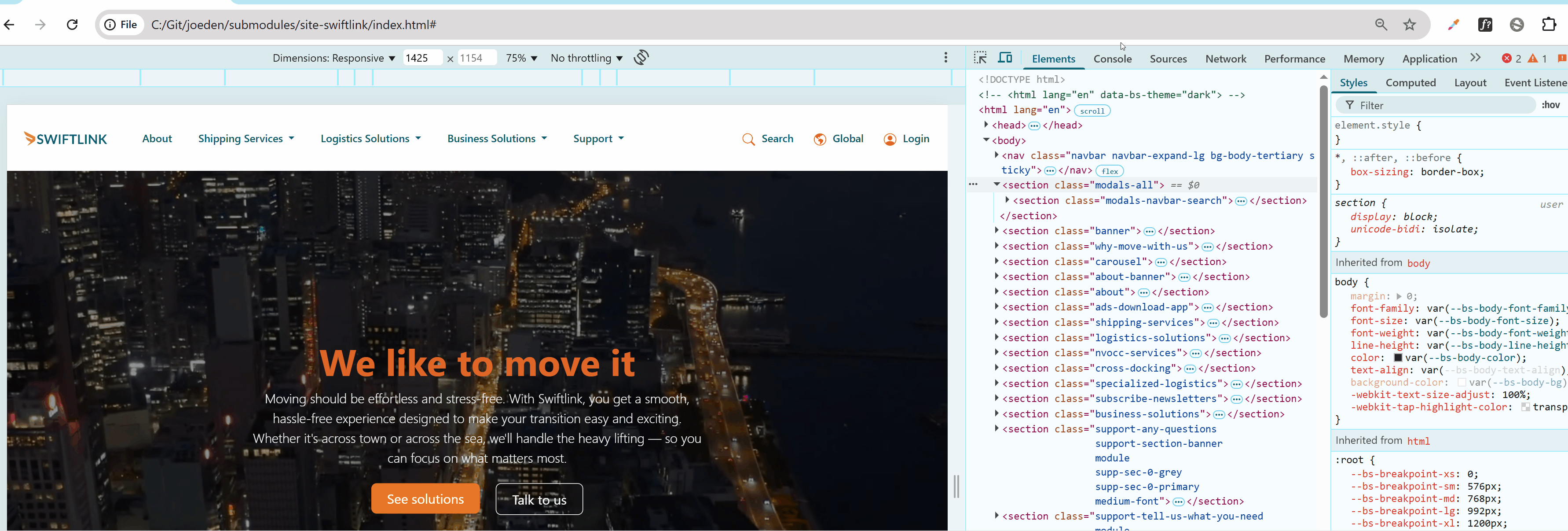
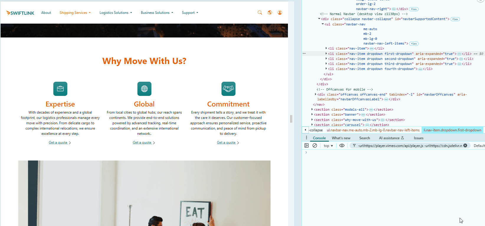
The Pesticide Chrome extension is used here to help visualize the CSS box model and layout, as seen below:
A more detailed breakdown:
The <menu> element:
class="search-modal-toolbar"– Applies custom styles via CSSrole="menu"– Helps screen readers recognize it as a menu<li>– A list item that holds the close button
Button attributes:
type="button"– Specifies it’s a clickable button (not a form submit)class="search-modal-close-button"– Used for stylingtitle="Close dialog"��– Shows tooltip on hoveraria-controls="dialog-id-search-in-header"– Connects button to the modal for accessibilitydata-bs-dismiss="modal"– A Bootstrap attribute that closes the modalaria-label="Close"– Describes the button for screen readers
SVG icon (the “X”):
<svg>– Container for the close iconclass="search-modal-close-icon"– Style hook for the iconviewBox="0 0 18 18"– Defines the coordinate space
Drawing the "X":
fill="none"– No fill inside the shapestroke="currentColor"– Uses the current text colorstroke-linecap="round"– Rounds the ends of linesstroke-linejoin="round"– Smooth joins at cornersstroke-width="2"– Line thicknesspoints="..."– Coordinates to draw the "X"
Change How Dropdowns Open
The default behavior of dropdown when expanded is to open downwards:
As a reference, the CSS is...
.select-items {
  top: 100%;
  left: 0;
  right: 0;
  border: 1px solid #ccc;
  border-top: none;
}
To have it open upward instead of downward, you can change its positioning from using top: 100% to bottom: 100%.
.select-items {
  top: auto;                     /* Disable top positioning */
  bottom: 100%;                  /* Position the dropdown above the element */
  border-top: 1px solid #ccc;    /* Optional: Adjust border if needed */
  border-bottom: none;
}
The bottom: 100% positions the dropdown so that its bottom edge aligns with the top of the parent container (opening the dropdown upward).
Test Dropdown Programmatically
You can programmatically toggle dropdowns through the DevTools console using:
bootstrap.Dropdown.getOrCreateInstance(
  document.querySelector('.nav-item.dropdown .dropdown-toggle')
).show();
Toggle the First Dropdown
To show the first dropdown:
bootstrap.Dropdown.getOrCreateInstance(
  document.querySelector('.nav-item.dropdown .dropdown-toggle')
).show();
To hide the first dropdown:
bootstrap.Dropdown.getOrCreateInstance(
  document.querySelector('.nav-item.dropdown .dropdown-toggle')
).hide();
Toggle All Dropdowns
To toggle all dropdowns on the page:
document.querySelectorAll('.dropdown-toggle').forEach(toggle => {
  const dropdown = bootstrap.Dropdown.getOrCreateInstance(toggle);
  dropdown._element.classList.contains('show') ? dropdown.hide() : dropdown.show();
});
To hide:
document.querySelectorAll('.dropdown-toggle').forEach(toggle => {
  const dropdown = bootstrap.Dropdown.getOrCreateInstance(toggle);
  dropdown._element.classList.contains('show') ? dropdown.hide() : dropdown.show();
});
Toggle a Specific Dropdown
To toggle a specific dropdown (e.g., using an ID or class):
const toggle = document.querySelector('.classname-of-dropdown > .dropdown-toggle');
const dropdown = bootstrap.Dropdown.getOrCreateInstance(toggle);
dropdown.toggle();
You can use the class name (.classname-of-dropdown) or an ID (#id-dropdown).