CSS Grid
Overview
CSS Grid allows arranging elements in rows and columns with precise control over spacing and alignment.
- Uses
display: gridto define a grid container - Defines columns with
grid-template-columns - Adds spacing with
grid-gap
Setting Up a Grid
To use CSS Grid, wrap elements inside a container and set its display to grid.
<div class="grid-container">
  <div class="grid-item">Item 1</div>
  <div class="grid-item">Item 2</div>
  <div class="grid-item">Item 3</div>
</div>
.grid-container {
  display: grid;
  grid-template-columns: 300px 300px;
  grid-gap: 20px;
}

.grid-item {
  background: lightgray;
  padding: 20px;
  text-align: center;
}
Notes:
display: gridenables the grid systemgrid-template-columns: 300px 300pxcreates two fixed-width columnsgrid-gap: 20pxadds spacing between columns
This setup ensures structured layouts with defined columns and spacing.
Making It Responsive
Fixed widths can cause layout issues on different screen sizes. To make the grid flexible, use fractions (fr).
.grid-container {
  display: grid;
  grid-template-columns: 1fr 1fr;
  grid-gap: 20px;
}
Note:
1fr 1frcreates two equal columns that adjust with the screen size- More columns can be added using additional
frvalues - The layout remains balanced and adapts dynamically
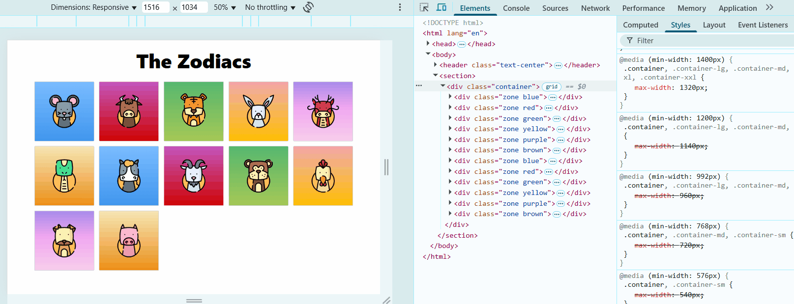
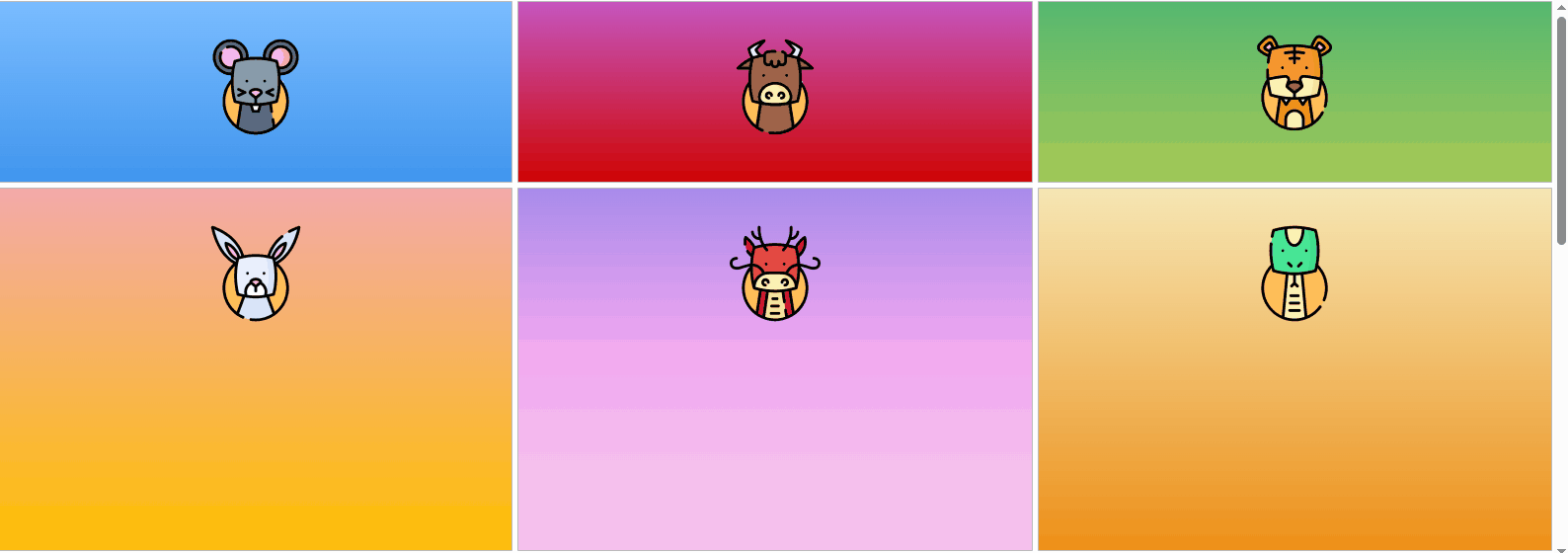
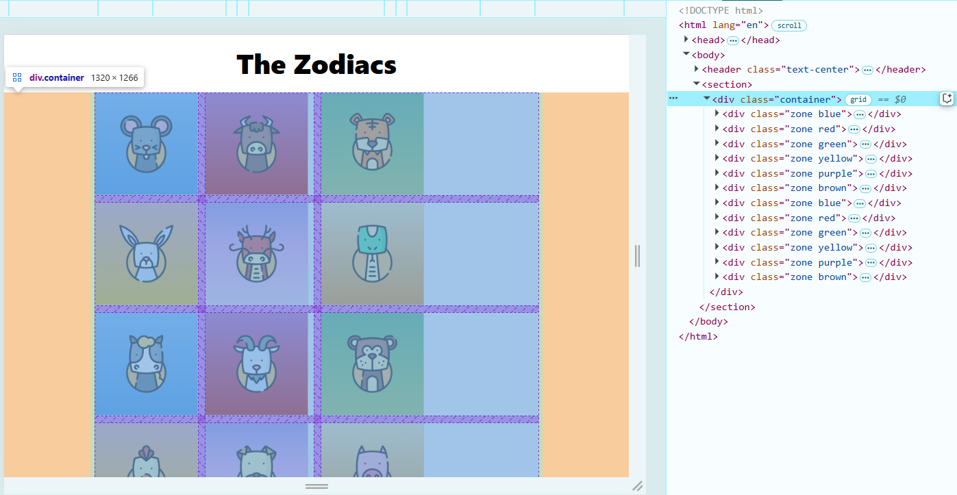
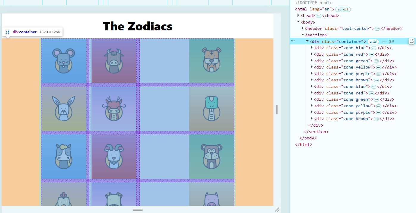
In the example below, we use 1fr 1fr which displays the images in two columns.
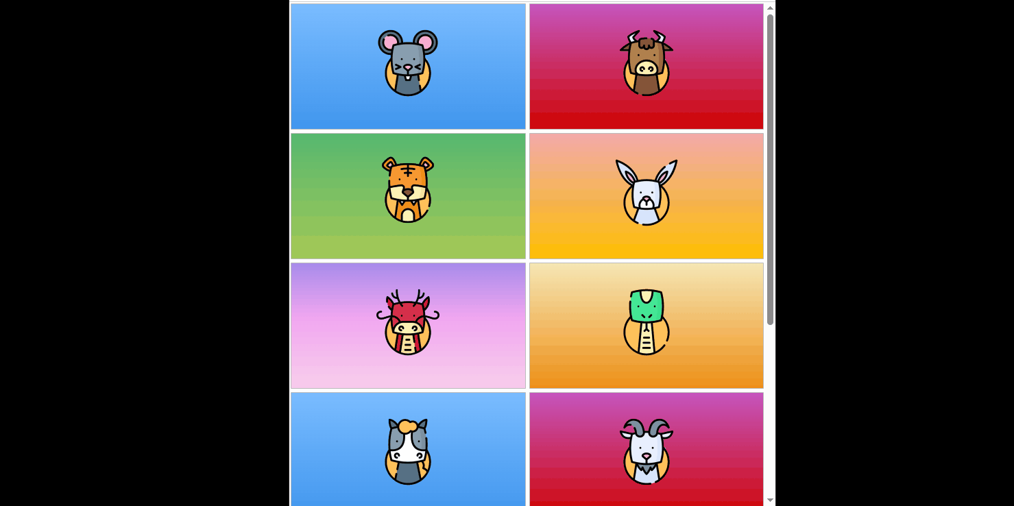
If we use 1fr 1fr 1fr, the images are arranged in 3 columns.
Control Column Sizes
Different column sizes can be set using fractional units.
.grid-container {
  display: grid;
  grid-template-columns: 1fr 1fr 2fr 1fr;
}
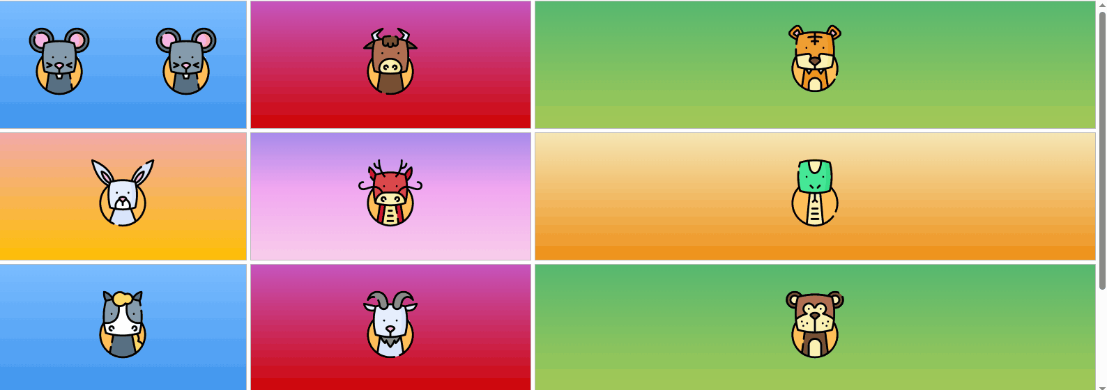
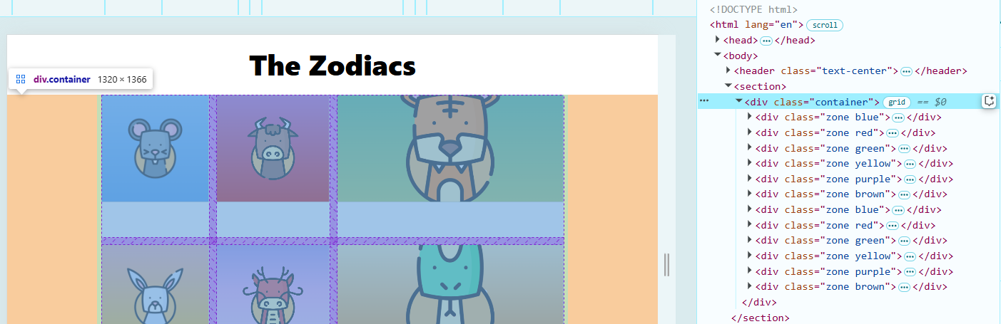
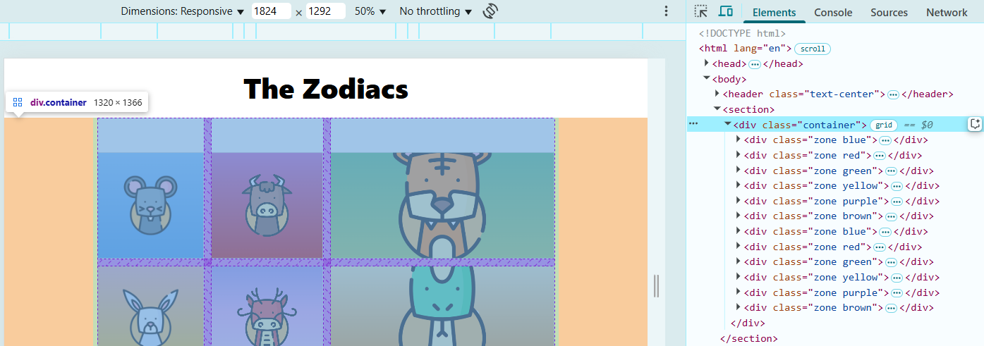
In this example, using 1fr 1fr 2fr 1fr creates four columns. The third column takes 2 fraction units, which makes it twice as wide as the others. The grid adjusts automatically when the screen size changes.
Control Row Sizes
Similar with columnns, CSS Grid also allows you to control rows.
- Use
grid-template-rowsto define row sizes - The grid automatically adjusts when items overflow
You can set row heights using fractional units (fr).
.grid-container {
  display: grid;
  grid-template-columns: repeat(3, 1fr);
  grid-template-rows: 1fr 2fr 3fr;
}
Note
- The second row is twice as tall as the first
- The third row is three times taller
If you don’t specify enough rows, the grid repeats the pattern for extra content.
Using repeat() for Columns
Instead of writing the same values multiple times, use repeat().
.grid-container {
  display: grid;
  grid-template-columns: repeat(3, 1fr);
}
Note:
- Creates three equal columns of
1fr - Equivalent to writing
1fr 1fr 1fr - Easily adjustable by changing the number
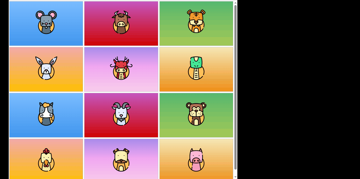
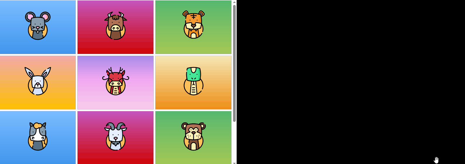
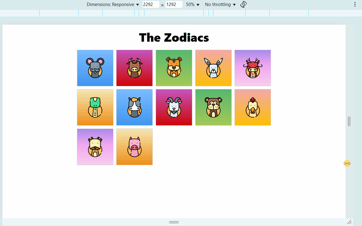
Using repeat(3, 1fr) creates three equal columns:
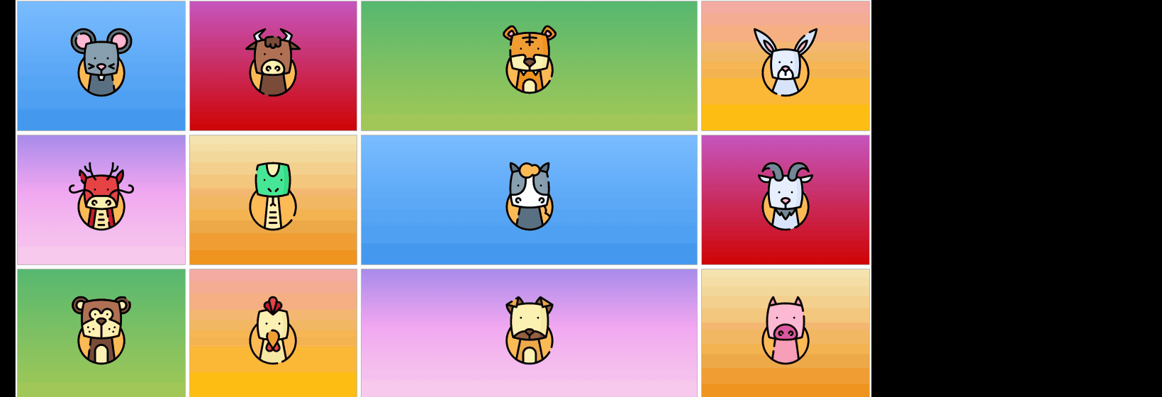
Using repeat(4, 1fr) creates four equal columns:

Using auto for Dynamic Columns
The auto property sizes a column based on its content.
.grid-container {
  display: grid;
  grid-template-columns: auto 1fr 2fr;
}
Note:
- The first column expands based on content
- The second and third columns use fraction-based sizing
- The grid ensures consistent alignment
This allows elements with different content sizes to fit naturally without breaking the layout.
Alignment
CSS Grid provides powerful alignment and layout options for web design.
-
justify-items- Aligns content along the row axis
- Options:
start | center | end | stretch - Default is
stretch
-
align-items- Aligns content along the column axis
- Options:
start | center | end | stretch
-
repeat()andminmax()- Helps create responsive grids
justify-items
The justify-items property controls horizontal alignment within grid cells. Setting it to center aligns all items in the middle of their respective cells.
.grid-container {
  display: grid;
  grid-template-columns: auto 1fr 2fr;
  grid-template-rows: 300px;
  justify-items: center;
}
Setting justify-items: start aligns items to the left of their grid cells.
justify-items: start;
Using justify-items: end moves items to the right of their grid cells.
justify-items: end;
align-items
Unlike justify-items, which aligns content horizontally, align-items controls vertical positioning within grid cells. For example, using align-items: start places items at the top of their grid cells.
.grid-container {
  display: grid;
  grid-template-columns: auto 1fr 2fr;
  grid-template-rows: 300px;
  align-items: start
}
Setting align-items: end moves items to the bottom of their grid cells.
align-items: end
Responsive Layouts
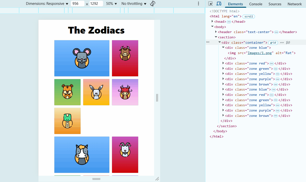
To make grids adapt to different screen sizes, use auto-fill with minmax().
auto-fill: Fills available space with as many columns as possibleminmax(200px, 1fr): Columns are set to 200px but expand when possible
Example:
.grid-container {
  display: grid;
  grid-template-columns: repeat(auto-fill, minmax(200px, 1fr));
}
This keeps columns responsive and ensures they adjust dynamically.
Customize Individual Items
Instead of applying styles to the entire grid, we can adjust the size and position of specific elements.
- Each grid item can span multiple columns or rows
- Make items larger or smaller while keeping them within grid structure
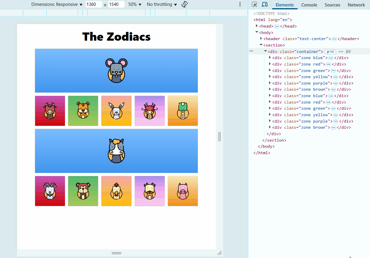
We can specify where a grid item starts and ends using grid-column-start and grid-column-end.
.blue {
  grid-column-start: 1;
  grid-column-end: 3;
}
Note:
grid-column-start: 1➔ Starts at the first columngrid-column-end: 3➔ Extends up to the third column
This makes the item span two columns. A shorthand version simplifies this:
.green {
  grid-column: 1 / 3;
}
Instead of separate start and end properties, we use grid-column: start / end for clarity.
Expand Grid Items Dynamically
Sometimes, we want an item to stretch to the end of the grid without counting columns manually. We can use -1:
.green {
  grid-column: 1 / -1;
}
Note:
-1represents the last column- The item stretches across the entire width
This makes the grid item flexible, occupying entire the stretch even with different screen sizes.
Using span for Dynamic Spans
Instead of specifying exact start and end points, we can use span:
.green {
  grid-column: span 2;
}
Note:
- The item spans across 2 columns
- Adjusts dynamically as grid layout changes
If the grid has more columns, the item still covers two, and it still maintains layout consistency.
Adjust Grid Rows
Similar to columns, we can control row positioning using grid-row:
.green {
  grid-row: 1 / 3;
}
Note:
- The item starts at row 1 and ends at row 3
- Items below it shift accordingly