CSS Display
Overview
The display property in CSS determines how elements are displayed on a webpage.
blockelements take up the full width of the containerinlineelements only use the space needed for their contentinline-blockallows setting the width but still keeps the element inline
For example:
<!DOCTYPE html>
<html lang="en">
<head>
  <meta charset="UTF-8">
  <meta name="viewport" content="width=device-width, initial-scale=1.0">
  <link rel="stylesheet" href="display.css">
  <title>Display Example</title>
</head>
<body>
  <div class="first">Block Element</div>
  <span class="second">Inline Element</span>
  <span class="third">Inline-Block Element</span>
</body>
</html>
/* display.css */
.first {
  display: block;
}

.second {
  display: inline;
}

.third {
  display: inline-block;
  width: 100px;
}
How it looks like:

Inline Elements
Inline elements like span can be used to style parts of text differently without affecting the layout.
- Inline elements don’t break the line
- You can style parts of a block element with inline elements
- Common inline elements are
span,img, anda
For example:
<!DOCTYPE html>
<html lang="en">
<head>
  <meta charset="UTF-8">
  <meta name="viewport" content="width=device-width, initial-scale=1.0">
  <link rel="stylesheet" href="display.css">
  <title>Inline Elements Example</title>
</head>
<body>
  <p>This is <span class="inline-text">important</span> text.</p>
</body>
</html>
.inline-text {
  color: red;
}
How it looks like:

Hiding Elements
Sometimes, you may want to hide an element from view without deleting it.
- Use
display: noneto remove it from the page entirely - Use
visibility: hiddento hide the element but keep its space on the page
For example:
<p style="display: none;">This is hidden.</p>
<p style="visibility: hidden;">This is invisible but still takes up space.</p>
Float
Float allows elements to be positioned next to each other by taking them out of the normal document flow.
- Moves elements left or right
- Used mainly for text wrapping around images
- Can affect layout, requiring a clear fix
For layout positioning, Flexbox and Grid provide better control. Float remains useful for specific cases, such as text wrapping.
- Modern layouts use Flexbox or Grid instead
- Float can cause unexpected issues in complex designs
- Use it only when necessary
Using Float
When an element is floated, content flows around it. Changing float: left; or float: right; moves the element to that side, letting other content wrap around it.
Example:
img {
  float: left;
  margin-right: 10px;
}
In this example, an image floats to the left, and text wraps around it.
Sample Files: Github
Clear
This ensures elements below a float stay in their expected position.
clear: left;stops wrapping around left-floated elementsclear: right;stops wrapping around right-floated elementsclear: both;stops wrapping around both sides
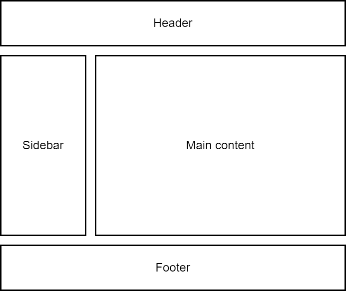
In the example below, the following are set:
- Sidebar is set to
float: left - Main content is set to
float: right
Be setting the footer to clear both the sidebar and main content, the footer stays below floated elements instead of wrapping around them.
footer {
  clear: both;
}
Float-Based Layout
Float can be used to position elements side by side.
float: left;moves an element to the leftfloat: right;moves an element to the right- Clearing helps maintain proper layout
Problems with Floats
Floats were widely used but had drawbacks.
- Difficult to align elements properly
- Required clearfix hacks for layout stability
- Not designed for complex grid structures
Floats work well for wrapping text around images but are not ideal for building full-page layouts. As a solution, developers started using Flexbox to dynamically adjust items based on available space.
For more information, please see CSS Flexbox