Exploratory Data Analysis
Overview
Exploratory Data Analysis (EDA) is a method introduced by John Tukey for investigating data, forming hypotheses, and understanding its characteristics, primarily through visualization.
- Developed by statistician John Tukey
- Focuses on visualizing and summarizing data
EDA typically follows data preparation and may uncover additional cleaning requirements.
- Can reveal new data cleaning needs
- Complements data preparation
Using EDA
When examining datasets, initial impressions from raw data can be misleading as iitial analysis might not show underlying differences. Even datasets with identical statistical metrics can vary significantly when visualized. Below are four different datasets. At first glance, they may seem similar based on basic data lines.
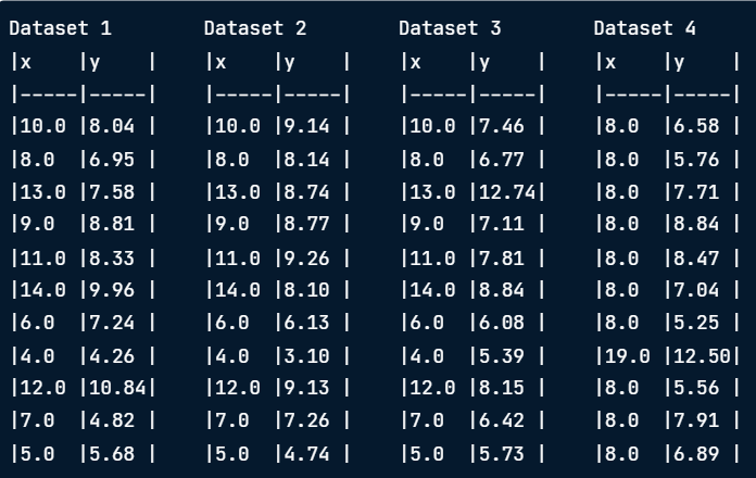
Despite having identical means, variances, correlation coefficients, and linear regression equations, these datasets tell different stories when visualized.
- Identical mean
- Identical variance
- Identical correlation coefficient
- Identical linear regression
Anscombe's Quartet
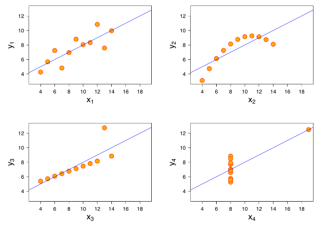
Anscombe's Quartet demonstrates the importance of visualization. The four datasets previously mentioned look similar by metrics but differ greatly in graphs.
Where:
- Graph 1: Linear relationship
- Graph 2: Non-linear relationship
- Graph 3: Linear line skewed by an extreme y value
- Graph 4: Apparent correlation due to an outlier
As we can see, vsualization is crucial for accurate data analysis, as it often uncovers patterns and anomalies that descriptive statistics might miss.
Case Study: SpaceX Launches
Analyzing SpaceX launch data helps us understand and visualize the information more clearly. Here’s a closer look at how to approach this.
First, check out the key features of the data, like flight numbers and payload mass. You might find some missing values, such as in the Payload Mass column, which is important to address.
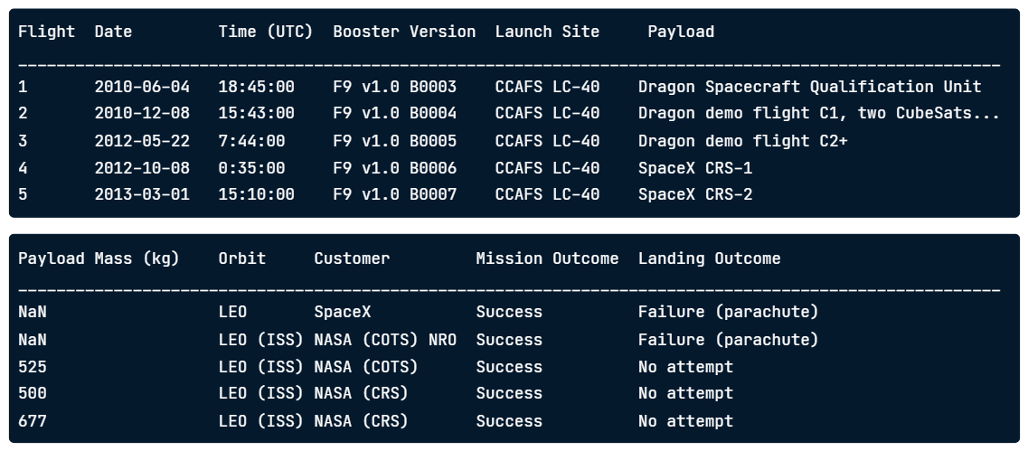
Calculating descriptive statistics can give us a basic overview. For example, the dataset covers 55 launches with two missing payload values and one failed mission. This summary helps us grasp the general performance.
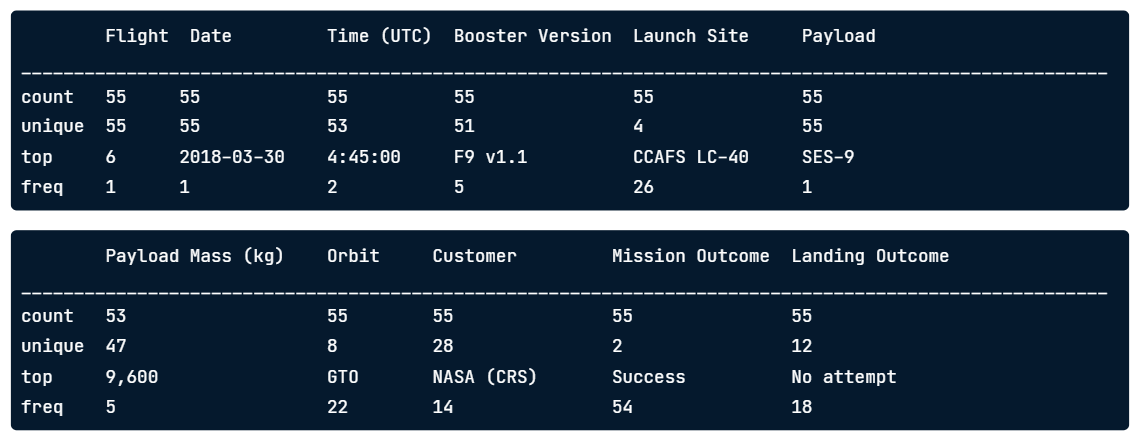
Where:
- Launch count: 55 launches
- Payload mass: 53 values due to missing data
- Mission outcome: Only 1 failure
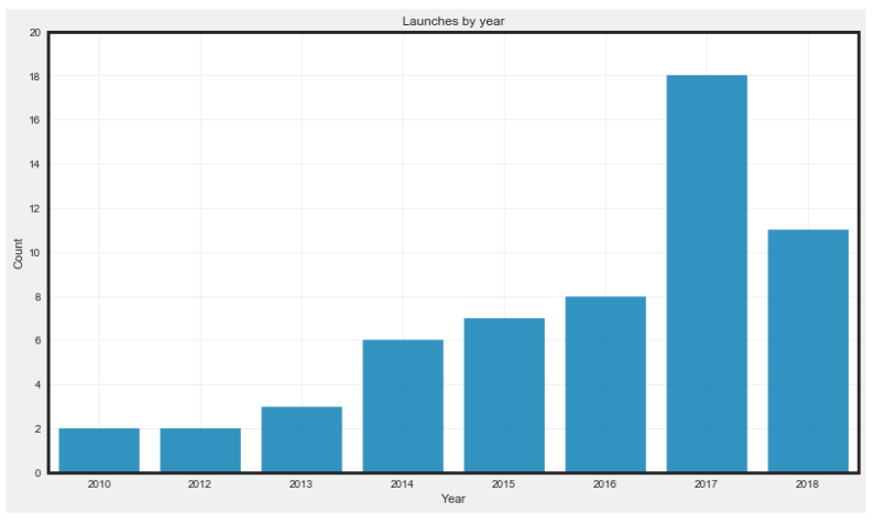
Visualization helps to uncover trends and patterns that raw statistics might miss. For instance, a visual chart can reveal that there were no launches in 2011. The launches increased over time and then doubled in 2017. This makes it easier to see changes and trends compared to just looking at numbers.
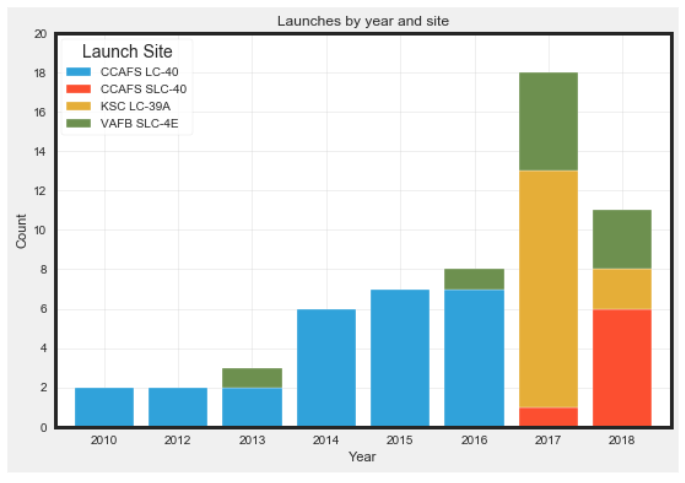
EDA also encourages asking additional questions, such as analyzing launch counts by site or mission outcomes. We can see that launches transitioned from Cape Canaveral to Kennedy Space Center Launch Complex 39.
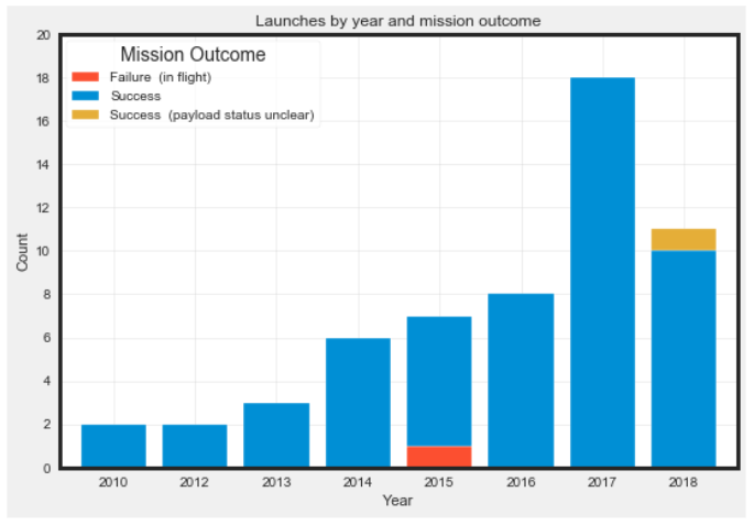
Leveraging EDA also allows to see that there was a single failure in 2015.
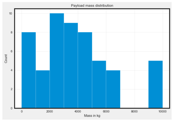
Lastly, identifying outliers is an important part of EDA. Outliers are unusual values that can significantly impact results. In this dataset, there are a few launches with payloads exceeding 7,000 kg, while the average payload mass is closer to 3,800 kg. Recognizing these outliers helps ensure more accurate data analysis.