Designing the Project Page
Overview
This page documents the complete design and implementation process for my site's projects page, including adding tags to project cards, implementing a 2-column layout with categories filter sidebar, and comprehensive styling for both light and dark modes.
Note: It actually took me multiple iterations to achieve the functional design.
Implementation Steps
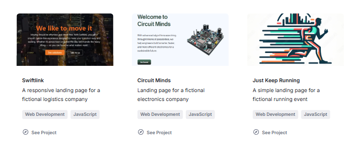
1. Add Tags to Project Cards
This enables categorization of projects with visible tags.
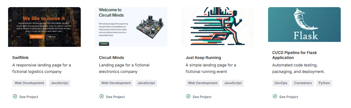
2. Style Project Tags
This focuses on customizing the appearance of tags.
- Added
.tagsand.tagCSS classes - Set tag background and text colors
- Added right margin for better spacing between them
- Added top and bottom margin for better separation from other content
- Implemented dark mode variants
See Project Card Tags: Add Tag Styling
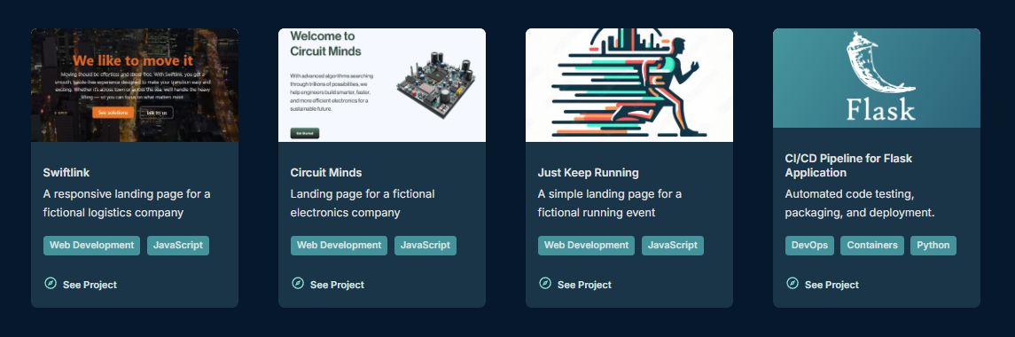
Dark mode:
3. Restructure Page Layout
After setting how each project card will look, the next step was to design the overall page layout.
Files modified:
src/pages/projects.tsxsrc/components/projects/Project.module.scss
I tried several variations, before settling on a 2-column grid with the categories sidebar on the left and the project cards on the right.
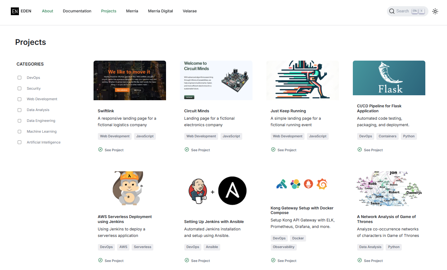
Initial customizations done:
- Wrapped page content so that it follows same max width as header
- Added padding to the page container for better spacing
- Added a header box above the page container for the "Projects" title
UPDATE: The more complex stuff like the toggable categories and responsive design came in step 6 and step 9.
4. Update the Card Layout
This step focuses on testing side-by-side card layout
- Converted cards to grid layout with image and content side-by-side
- Updated card dimensions and spacing
- Added responsive fallback for mobile
Files modified:
src/components/projects/Project.tsxsrc/components/projects/Project.module.scss
UPDATE: After testing the side-by-side layout, I decided to revert back to the original vertical card layout where the image is stacked above the body and footer.
5. Refine Card Styling
This step focuses more on styling the project cards to match the overall design aesthetic of the site.
Files modified:
src/components/projects/Project.tsxsrc/components/projects/Project.module.scss
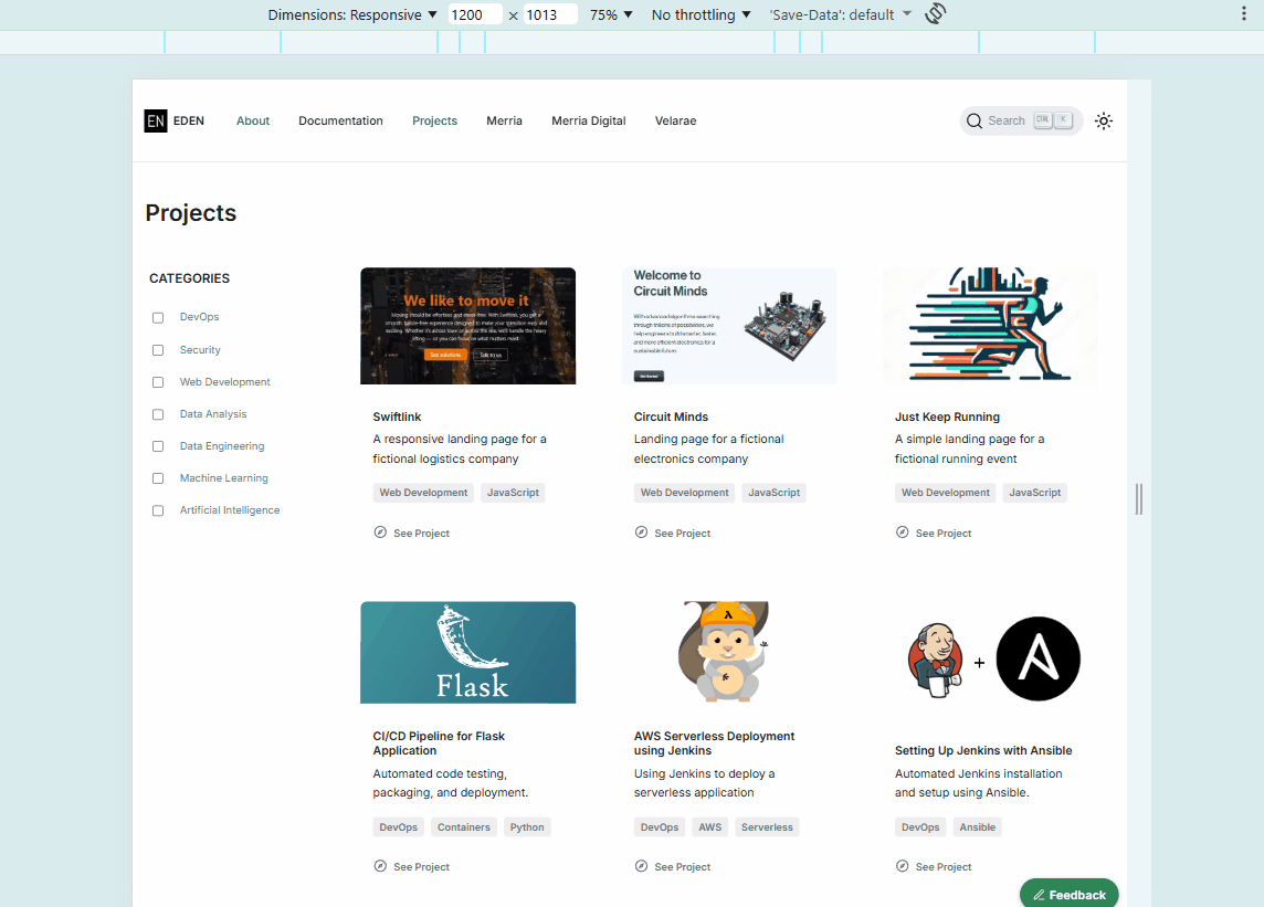
Initially, I had added borders to the cards and buttons, but after testing it, I decided to remove them for a cleaner look.
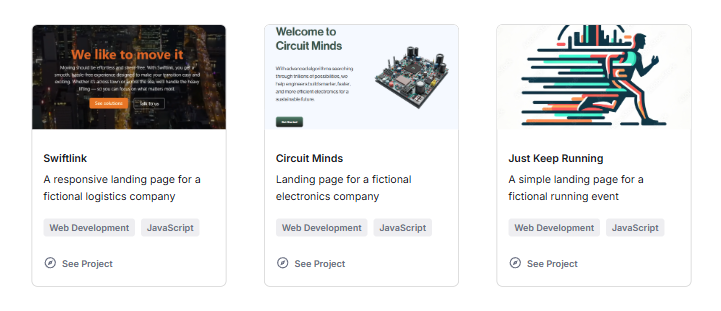
No borders looks better (only done on light mode):
UPDATE: I've also set the project cards to have a "hover effect" and a "box-shadow effect on hover", which adds a subtle shadow to the card when hovered over. This gives it a slight "lift" and makes it more interactive.

I experimented with adding the box-shadow effect on dark mode but it made the cards appear a bit too blurry and less defined. As an alternative, I switched to a tighter border-like ring plus a darker depth shadow so the card edge stays sharp in dark mode.
UPDATE: I realized that the darker shadow on hover didn't do much, but the ring effect did make the card edges more defined. In the end, I just kept both effects.
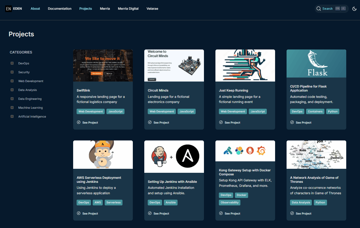
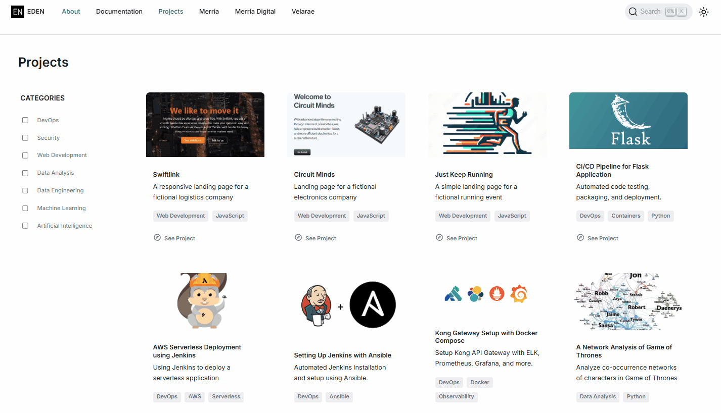
6. Hide Category Sidebar on Small Screens
The idea came to me when I was testing the responsive design on mobile. I realized that showing both the categories sidebar and the project cards on small screens made the usable width too narrow, which made the project cards look cramped and unreadable. As a solution, I decided to hide the entire column 1 (the categories sidebar) on small screen sizes, which allowed the project cards to use the full available width and remain readable.
Might be useful to note: To hide the column, set display: none on the left column at small screen widths using a media query.
Downside: Category filtering is limited to laptop and larger screen sizes. However, since the cards are displayed in a single column on mobile, the layout is already simplified and the category filter would be less useful in that context.
Tradeoffs: It would display all the project cards in a single column, which meant if there are many projects, the user would have to scroll through all of them without the ability to filter. However, I think this is an acceptable compromise, as it preserves the overall design on smaller screens.
Files modified:
src/pages/projects.tsxsrc/components/projects/Project.module.scss
UPDATE: This has been changed to allow the category filtering on mobile screen sizes by converting the sidebar categories into pill-shaped buttons laid out in a wrapping row at the top of the page. See Mobile Category Pills and Reset Button.
7. Add Categories Filtering
This is actually the most complex step, as it involved updating the JSX structure to allow selecting categories, connecting the checkboxes to the state, and then implementing the filtering logic to show/hide project cards based on selected categories.
File modified: src/pages/projects.tsx
Filtering behavior:
- If no category is selected, all project cards are displayed
- If one category is selected, only cards with a matching tag are displayed
- If multiple categories are selected, a card is displayed when it matches at least one selected category
Notes:
- Used React states to track selected categories
- Wired each checkbox to controlled state using
checkedandonChange - Added multi-select filtering so multiple categories can be active at the same time
- Kept all projects visible when no category is selected
- Filtered cards by matching selected category labels against each project's
tags
Technical Details
Component Structure
projects.tsx
├── pageContainer (max-width: 1536px)
    ├── leftColumn
    │   ├── categoriesHeader ("CATEGORIES")
    │   └── categoriesList (checkboxes, hidden on small screens)
    └── rightColumn
        └── cardsList (flex-wrap grid of Project components)

Above pageContainer
└── headerBox ("Projects" title)

Project.tsx
├── cardContainer
    └── card
        ├── image
        ├── card__body
        │   ├── title
        │   ├── description
        │   └── tags (optional)
        └── card__footer
            └── link with icon ("See Project")

Filtering logic in projects.tsx
├── categories array
├── selectedCategories state
├── handleCategoryToggle()
└── filteredProjects derived list
CSS Architecture
CSS is organized using a combination of BEM naming conventions (Block, Element, and Modifier) and modular SCSS files.
The main CSS file for the projects page is Project.module.scss, which contains styles for the overall layout, project cards, tags, and responsive design.
| Aspect | Details |
|---|---|
| Layout | CSS Grid for overall page structure, Flexbox for cards and sidebar |
| Responsive | Mobile-first approach with breakpoints at multiple screen sizes |
| Theme | Light and dark mode support using CSS custom properties |
| Spacing | Consistent margins and padding defined (used rem and px units) |
| Colors | Gray-based color palette for a subtle and professional appearance |
Key CSS classes:
| Class | Purpose |
|---|---|
.pageContainer | Main 2-column grid container |
.leftColumn | Sidebar container |
.rightColumn | Content area |
.cardsList | Flex-wrap grid for project cards |
.card | Individual project card (borderless, white background) |
.tags | Container for tag elements |
.tag | Individual tag styling (gray background) |
.categoriesList | Sidebar filter list |
.categoryItem | Individual filter item with checkbox and label |
Filtering Logic
| Aspect | Details |
|---|---|
| State Management | useState stores the currently selected category labels |
| Controlled Inputs | Each checkbox reflects state through the checked prop |
| Toggle Handling | Selecting a category adds it to the active list; selecting it again removes it |
| Matching Rule | Filtering checks project tags and displays a card when any selected category matches one of its tags |
| Fallback Rule | When no categories are selected, the full project list is displayed |
Challenges and Solutions
| Challenge | Problem | Solution |
|---|---|---|
| Import path issues | Docusaurus v3 API changes caused build failures | Updated imports and component structure for compatibility |
| Layout responsiveness | 2-column layout needed mobile fallback | Added media queries to collapse to a single column on small screens |
| Tag positioning | Tags needed proper spacing from content | Added margins and flexbox for consistent alignment |
| Dark mode consistency | All new elements needed dark theme variants | Extended dark mode CSS with matching color variables |
| Mobile card readability | Sidebar reduced card width on phones | Hid column 1 at small widths so project cards could render fully |
Future Enhancements
Some stuff I've searched online which I'm thinking of adding in the future:
- Tag Management - Dynamic tag generation from project data
- Animation - Add smooth transitions for filter interactions
- Search - Add text search alongside category filters
- Empty State - Add a message for filter combinations with no matching projects