Navbar Search and Theme Toggle Overlap
Overview
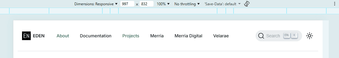
This page documents an issue in the site navbar where the Algolia search bar or search icon overlapped the dark mode toggle on screen sizes of 996px and below.
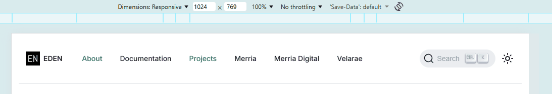
The intended layout was for both controls to remain visible on the same row, with the search control on the left and the dark mode toggle as the rightmost item.
Root cause summary:
The issue came from the responsive CSS, not from Algolia or the Docusaurus navbar config. On medium screens, the navbar did not size the search control and theme toggle correctly, the search button stayed too wide, and a generated mobile rule still positioned the search container absolutely.
See the Main Cause section below for a detailed explanation of the root causes and the specific CSS rules that were involved.
After Fix:
Observations
On screen sizes of 996px and below, the search control and the dark mode toggle did not stay properly aligned beside each other. Instead, the search control could expand into the same horizontal area needed by the toggle, and the toggle could then appear on top of the search control.
The expected behavior was:
- The search control remains visible
- The dark mode toggle remains visible
- The search control stays immediately to the left of the toggle
- The dark mode toggle stays as the rightmost visible navbar item
Root Cause
The main cause was in src/css/custom.scss, and it had four layers.
Issue 1: Misplaced Responsive Rule
- The
996pxbreakpoint styles were nested inside the600pxmedia query - This prevented them from applying across the full intended range
- As a result, layouts between
601pxand996pxbehaved incorrectly
Issue 2: Search and Toggle Layout Conflict
- The search container used a rough viewport-based max width
- The dark mode toggle used
position: relativewith a higherz-index - This caused both elements to compete for space instead of aligning properly
- In some cases, the toggle overlapped the search instead of staying beside it
Issue 3: DocSearch Button Was Still Too Wide
- The DocSearch button remained too wide at medium widths
- Search and toggle were siblings, so DOM order was not the problem
- The layout needed a compact search control, not only better flex rules
Issue 4: Generated Mobile CSS Still Overrode The Layout
- Docusaurus generated a mobile rule for
996pxand below - That rule set the search container to
position: absolute - It also anchored the search container with
right: var(--ifm-navbar-padding-horizontal) - Because of that, the search container stayed on top of the row instead of behaving like a normal flex item
Files Involved
The following files were involved in the investigation:
src/css/custom.scssdocusaurus.config.ts
The following file was modified to fix the issue:
src/css/custom.scss
The navbar item order in docusaurus.config.ts was relevant because the search item is declared on the right side of the navbar:
navbar: {
  items: [
    {
      type: 'search',
      position: 'right',
    },
  ],
}
That configuration was not the source of the bug, but it was part of the layout context because the CSS had to preserve the expected right-side ordering.
Problematic Code
The section below shows the original logic that contributed to the overlap:
/* Hide theme toggle in mobile sidebar */
.navbar-sidebar [class*="colorModeToggle_"] {
  display: none !important;
}

/* Ensure theme toggle is visible on medium screens */
@media (max-width: 996px) {
  /* Force dark mode toggle to stay visible in main navbar */
  [class*="toggle_"][class*="colorModeToggle_"] {
    display: block !important;
    position: relative;
    z-index: 1001;
  }

  .navbar__items--right {
    display: flex !important;
    align-items: center;
    gap: 0.5rem;
  }

  /* Prevent search from overlapping toggle */
  [class*="navbarSearchContainer_"] {
    flex-shrink: 1;
    max-width: calc(100vw - 200px);
  }

  /* Ensure navbar sidebar doesn't show theme toggle */
  .navbar-sidebar [class*="toggle_"][class*="colorModeToggle_"] {
    display: none !important;
  }
}
This approach had the following problems:
- The rule placement was wrong for the intended responsive range.
- The search width limit was based on the viewport, not on real remaining flex space.
- The toggle used stacking behavior through
z-index - The stacking behavior masked the layout conflict instead of solving it.
The right side of the navbar is a flex row, so each element needs predictable sizing. This means that each element must either shrink correctly or reserve a stable width. The issue came from unstable width handling and stacking behavior.
- Search container could shrink, but wasn’t properly constrained
- Search container should have been constrained by the available space
- Toggle was brought forward using a higher
z-index
Because of that, when horizontal space became tight, the search control and the toggle were no longer participating in a stable side-by-side layout. The search container still occupied too much space, and the toggle then appeared above it instead of remaining in a clean row.
During verification of the generated HTML in the built site, the navbar structure was confirmed to be:
<div class="navbar__items navbar__items--right">
  <div class="navbarSearchContainer_Bca1">...</div>
  <div class="toggle_vylO colorModeToggle_DEke">...</div>
</div>
That confirmed the search container and the dark mode toggle were siblings, which meant the remaining issue was width, not DOM order.
During verification of the built stylesheet, the generated mobile CSS also showed that Docusaurus was still forcing the search container out of the normal flex flow:
@media (max-width: 996px) {
  .navbarSearchContainer_Bca1 {
    position: absolute;
    right: var(--ifm-navbar-padding-horizontal);
  }
}
That generated rule was the final reason the search control still sat on top of the dark mode toggle even after the earlier flex fixes were applied.
Solution
The fix was implemented in src/css/custom.scss, and it focused on replacing the loose width and stacking behavior with explicit flex behavior. It also reduced the width of the search button at 996px and below, and it explicitly overrode the generated Docusaurus mobile rule that positioned the search container absolutely.
- Moved the
996pxrule into its own top-level media query - Kept the right side of the navbar as a no-wrap flex row
- Kept search container at auto width instead of a loose viewport-based width
- Converted search control into a compact icon-only button at
996pxand below - Kept the theme toggle as a fixed-width flex item
- Overrode the generated search container positioning with
position: static !important - Removed the
z-indexandposition: relativeworkaround
The updated CSS is shown below:
/* Ensure theme toggle and search stay aligned on medium screens */
@media (max-width: 996px) {
  .navbar__inner {
    gap: 0.5rem;
  }

  .navbar__items--right {
    display: flex !important;
    align-items: center;
    justify-content: flex-end;
    flex-wrap: nowrap;
    gap: 0.5rem;
    margin-left: auto;
    min-width: 0;
    flex: 0 0 auto;
  }

  .navbar__search,
  [class*="navbarSearchContainer_"] {
    order: 1;
    flex: 0 0 auto;
    min-width: 0;
    max-width: none;
    width: auto;
    margin-right: 0;
    position: static !important;
    right: auto !important;
    padding: 0;
  }

  .navbar__search .DocSearch-Button,
  [class*="navbarSearchContainer_"] .DocSearch-Button {
    width: auto;
    min-width: auto;
    max-width: none;
    margin: 0;
    padding: 0.45rem;
  }

  .navbar__search .DocSearch-Button-Placeholder,
  .navbar__search .DocSearch-Button-Keys,
  [class*="navbarSearchContainer_"] .DocSearch-Button-Placeholder,
  [class*="navbarSearchContainer_"] .DocSearch-Button-Keys {
    display: none;
  }

  .navbar__search .DocSearch-Button-Container,
  [class*="navbarSearchContainer_"] .DocSearch-Button-Container {
    margin: 0;
  }

  [data-theme-toggle],
  [class*="toggle_"][class*="colorModeToggle_"] {
    order: 2;
    flex: 0 0 auto;
    display: flex !important;
    align-items: center;
    justify-content: center;
    position: static;
    z-index: auto;
    margin-left: 0;
  }

  [class*="colorModeToggle_"] {
    display: flex !important;
  }

  [class*="toggle_"][class*="colorModeToggle_"] .toggleButton_gllP {
    display: flex;
  }

  .navbar-sidebar [class*="toggle_"][class*="colorModeToggle_"],
  .navbar-sidebar [class*="colorModeToggle_"] {
    display: none !important;
  }
}
Result
After the fix, the navbar behaves correctly for screen sizes of 996px and below. The search control remains visible, and the dark mode toggle remains visible, and both controls stay aligned on the same row. The search control stays on the left of the toggle, and the toggle remains the rightmost navbar item.
The final solution is more reliable because it uses proper flex sizing and ordering, because it removes the stacking workaround that was only hiding the underlying layout problem, and because it explicitly cancels the generated mobile search positioning rule. It also reduces the width of the search control at medium sizes, which removes the space conflict entirely.
When two controls overlap, it is usually better to define explicit flex behavior for both elements than to rely on z-index, rough viewport calculations, or positioning tricks.