Dot Plots
Overview
Dot plots are useful in the same scenarios as bar plots, offering two main benefits:
- Logarithmic Scale: They can use a logarithmic scale, which is helpful for displaying data with a wide range.
- Multiple Metrics: They allow for plotting multiple metrics on the same graph.
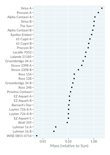
Case Study: Stars closest to Earth
This dataset features the stars closest to Earth, with distances measured in light years and masses in solar masses (multiples of the Sun's mass).

Bar vs. Dot
The bar plot shows star masses from the nearest to the furthest star. The wide range in bar lengths and the visibility issues with shorter bars make a logarithmic scale more appropriate. However, bar plots cannot use a logarithmic scale because the logarithm of zero is undefined.
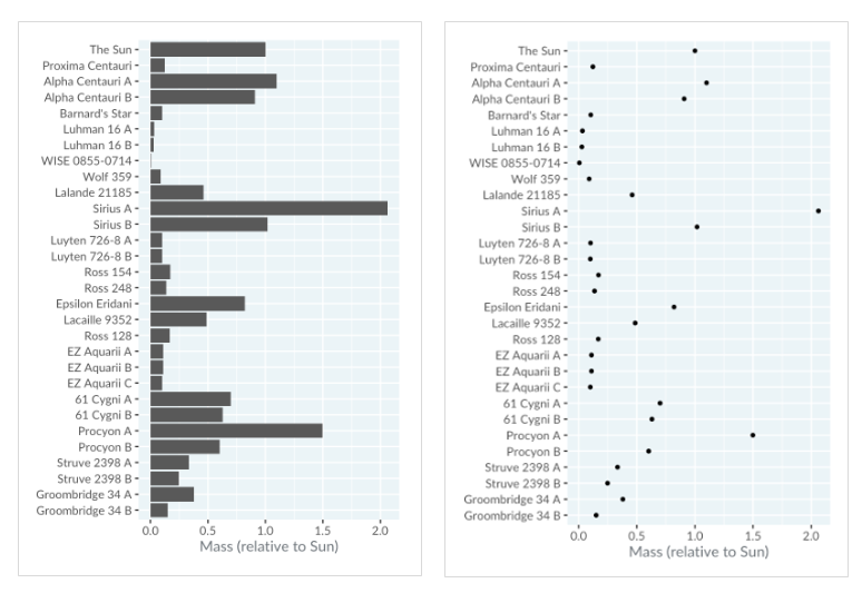
Instead, a dot plot can be used to represent this data, where each dot corresponds to the top of the respective bar.
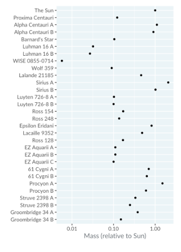
Logarithmic Scales
Logarithmic scales are useful for comparing how many times heavier one star is compared to another, especially when dealing with a wide range of values.
Sorting
Similar to bar plots, the order of rows in a dot plot is important. Sorting the rows from the heaviest to the lightest star makes it easier to identify which star is the heaviest or lightest among those nearest to Earth.