Polar Coordinates
Pie Plots
Pie plots are quite popular, but they're not always the best choice for displaying data.
Bar Plot + Polar Coordinates
To create a pie plot, you start with a bar plot and then switch the coordinate system from Cartesian (x and y axes) to polar coordinates. Essentially, a pie plot transforms bar lengths into angles.
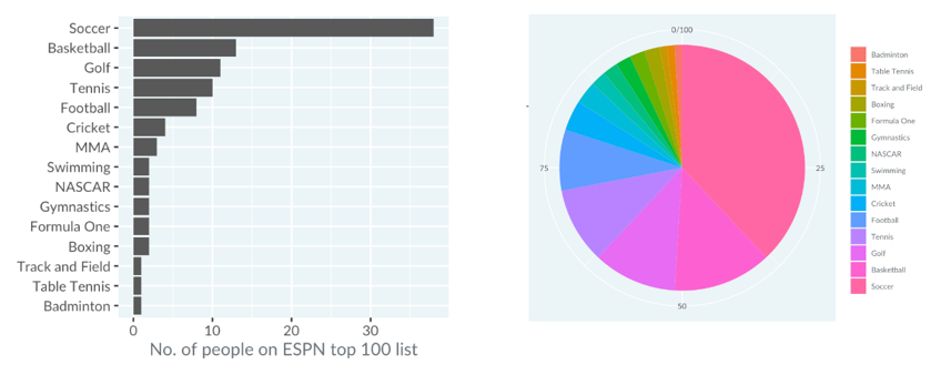
However, pie plots are often harder to read compared to bar plots. For instance, looking at the information in both plots, we can see that it's much more challenging to determine exact quantities, like the number of cricketers on a list, using a pie plot. Research shows that bar plots are generally more straightforward to interpret.
When to use Polar Coordinates
They're usually not recommended, except in specific cases. If your data has a natural circular pattern, such as time of day or direction, polar coordinates can work.
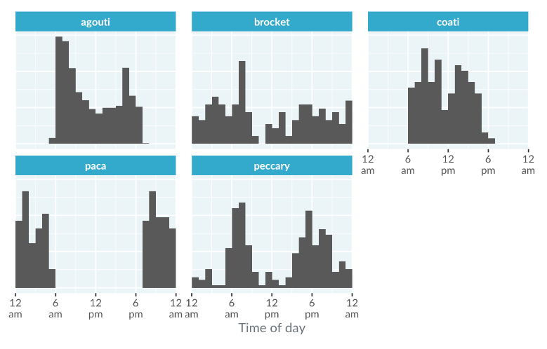
For example, here's a histogram showing animal activity from a Panama camera trap dataset. This plot struggles with representing data accurately across midnight, as it doesn’t recognize that midnight on the left and right of the x-axis are the same.
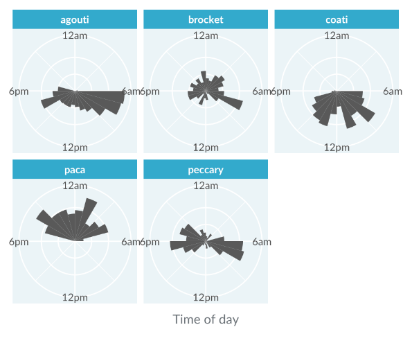
Rose Plot
A solution is to convert the histogram into a rose plot using polar coordinates. In this plot, the x-axis is turned into angles while the bar heights remain as lengths. This adjustment makes it clearer that the paca's nocturnal activity is continuous throughout the night, rather than split into two distinct bursts.