Sensory Overload
Overview
There are two basic measures of a good data visualization.
- Number of insights a reader can gain
- How quickly readers can get those insights
Chartjunk
Chartjunk includes anything that hinders insight. A related term is skeuomorphism, which involves adding real-world elements to virtual objects, like shadows on bars in a bar plot.
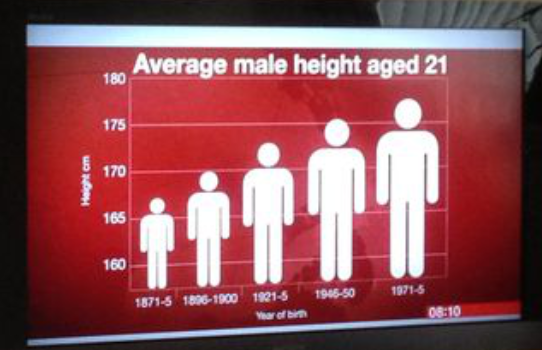
Above is an example from the BBC TV network found on the Junk Charts blog shows this. It should probably be a bar plot, but with the y-axis not starting at zero, it might be aiming for a dot plot. Using a picture of a man instead of a bar complicates understanding.
Skeuomorphism
This is another example from Fox News. The y-axis doesn’t include zero, and time periods are limited to October to April, omitting May to September. Skeuomorphic elements like shadows and 3D bars distort perception.

By removing these elements, the data becomes clearer.
Extra Dimensions
A plot from the "dataisugly" subreddit has many issues, including unnecessary 3D perspective. Bar plots should be 2D with categories on one axis and a continuous variable on the other. 3D bars add no information and make judging lengths harder.
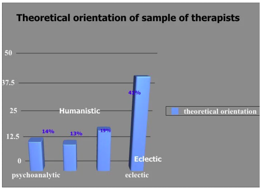
A 2D bar plot is easier to read, though some issues remain with labels and percentages.
Ostentatious Colors and Lines
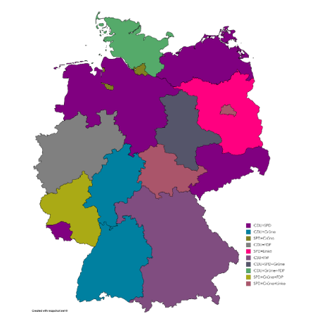
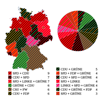
Another plot from "dataisugly" shows seats in the German Federal Council. Each political party has a color, and states are colored by the winning party with stripes for other parties sharing power. The result is too visually overwhelming to provide insights. Stripes and hatching should generally be avoided.
A Reddit user improved the plot by removing hatching, making it more readable.