Plotting Multiple Variables at Once
Overview
To handle the visualization of many variables simultaneously, you can use advanced plotting techniques such as pair plots, correlation heatmaps, and parallel coordinates plots.
Using Pair Plots
Pair plots are effective for visualizing up to ten variables at once. They display the distribution of each variable and the relationships between each pair.
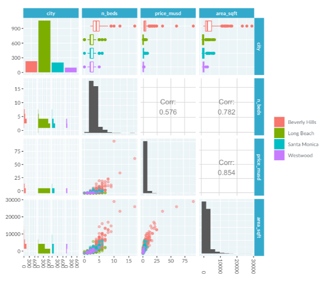
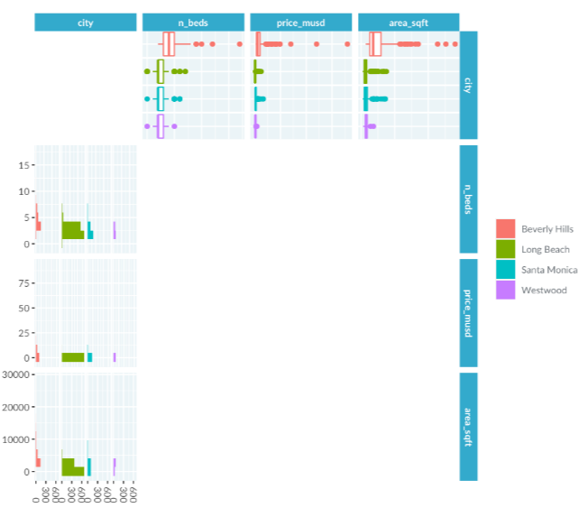
Above is a pair plot of LA home prices includes four variables, arranged in a grid of panels. Each panel provides insights into different aspects of the data.
Diagonal Panels
Panels along the diagonal show the distribution of variables. For categorical variables, like city, the distribution is displayed as a bar plot.
Continuous variables, such as number of beds, price, and area, are shown with histograms.
Off-Diagonal Panels
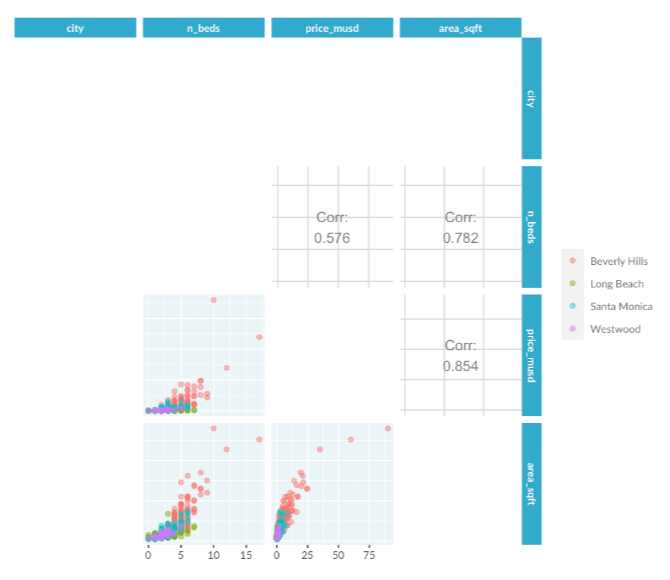
Panels off the diagonal reveal the relationships between pairs of variables. Continuous variable pairs are represented by scatter plots, showing their correlation. For instance, a scatter plot might show the relationship between the number of beds and area, with a correlation value indicated.
Categorical and Continuous Variables
When one variable is categorical and the other is continuous, the plot includes a box plot and a histogram. For example, the box plot shows prices by city, and the histogram represents the same data.
Correlation Heatmaps
Pair plots are useful for quickly exploring datasets. For datasets with many continuous variables, a correlation heatmap, a variant of the pair plot, offers a more compact and scalable alternative.
Correlation heatmaps display the relationships between continuous variables using color rather than numbers. They are useful for comparing a large number of variables.
Heatmap Example
In a customer satisfaction survey dataset, the correlation heatmap reveals strong relationships between various product features. Bright red areas indicate high correlation among price-related aspects.
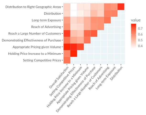
Reference: Rossi, Allenby, and McCulloch (2005). Bayesian Statistics & Marketing
Parallel Coordinates Plots
For datasets with many continuous variables, parallel coordinates plots are effective for understanding relationships or grouping data into clusters.
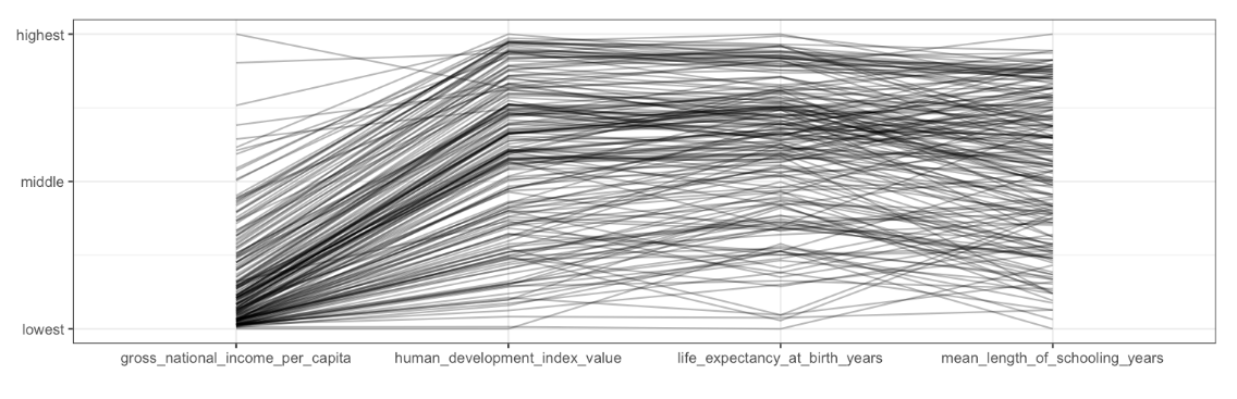
Above is a parallel coordinates plot shows multiple variables, including the human development index score, with each line representing a country. Variables are plotted along the x-axis, and the y-axis ranges from the lowest to the highest value for each variable. Splitting the data by continent can reveal patterns.
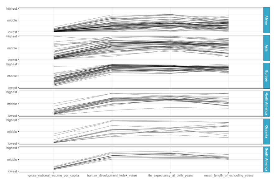
By segmenting the dataset by continent, distinct patterns emerge. For example, South American countries show consistent metrics, while European countries have high values across all metrics. African countries display low GNIs with a broad range in other metrics. This plot allows for easy comparison of many variables simultaneously.
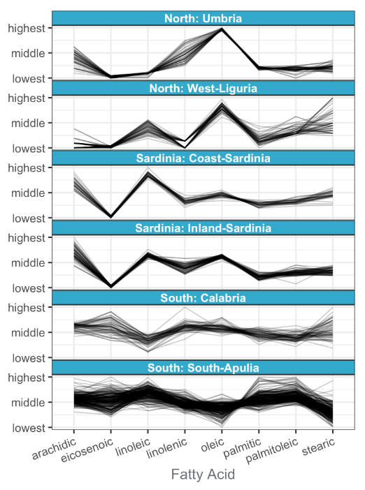
Case Study: Fatty acid levels in olive oils
This dataset contains fatty acid levels from olive oil samples sourced from six different regions in Italy. Each line in the plot corresponds to a single oil sample. Because the region is a categorical variable, there are six parallel coordinates plots, with one plot for each region.
Reference: Graphics of large datasets
Observations:
- Sardinian oils have low elcosenoic acid and high linoleic acid levels.
- Calabrian oils show a wide range of elcosenoic and stearic acid levels.
- Northern oils have high oleic acid levels.