Visualizing one variable
Histograms
Histograms are used to visualize the distribution of a continuous variable. They reveal insights into the shape of the data's distribution, including its range, central tendencies, and the frequency of various values.
- Ideal for examining a single continuous variable
- Analyze distribution shape, range, and common values
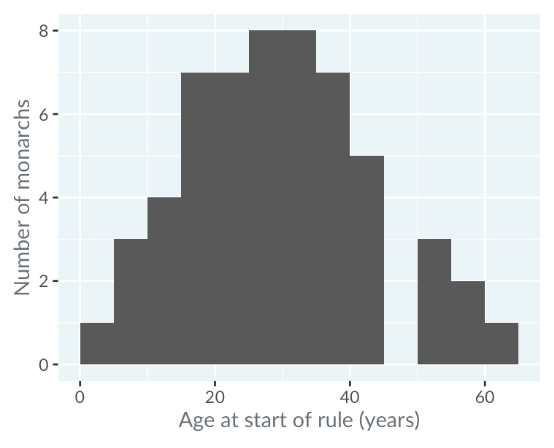
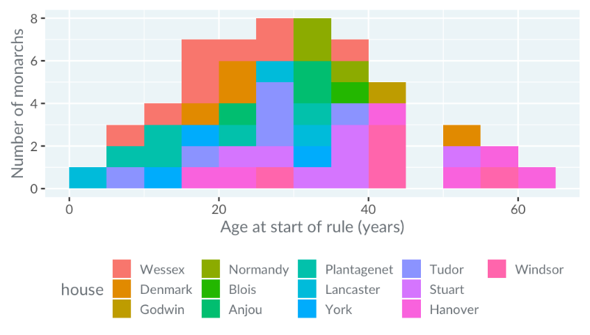
Below is a data set on the Monarch ages. Examining the ages of kings and queens of England and Britain at their ascension can provide insights into historical patterns of leadership age.
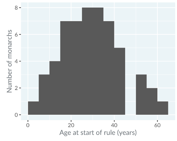
Age Distribution
Histograms display age data by grouping it into intervals or "bins". The x-axis represents these age bins, and the y-axis shows the count of monarchs in each bin.
-
Age bins like 0-5 years, 5-10 years, etc.
-
No monarchs began ruling between ages 45 and 50
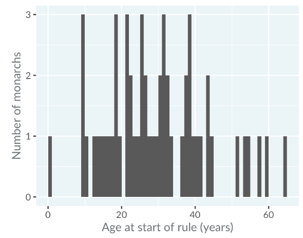
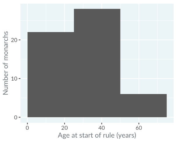
Binwidth
The binwidth affects the histogram's clarity and informativeness. Testing various binwidths can help find the most useful representation.
-
Narrow Binwidth (1 year): Can lead to noisy data and unclear distribution
-
Wide Binwidth (25 years): May obscure details in the distribution
Modality
Modality refers to the number of peaks in the histogram's distribution.
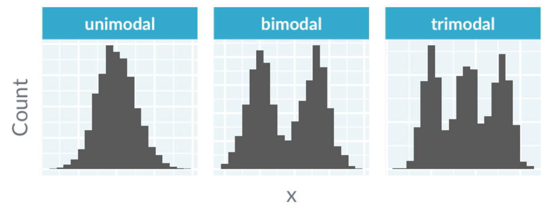
For instance, the age distribution of monarchs is unimodal, peaking between 25 and 35 years.
Skewness
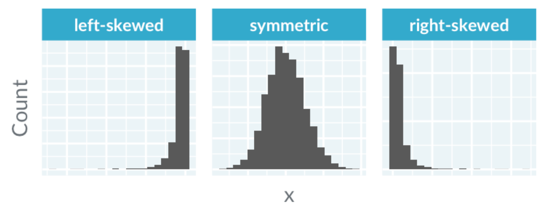
Skewness assesses the symmetry of the distribution.
- Left-skewed: Outliers on the left; imagine a skewer pointing left
- Right-skewed: Outliers on the right; skewer points right
The distribution in the Monarch dataset is nearly symmetric.
Kurtosis
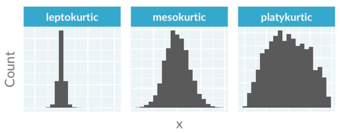
Kurtosis measures the presence of extreme values and the shape of the distribution's tails.
- Mesokurtic: Normal bell curve shape
- Leptokurtic: Sharp peak with many extreme values; relevant for financial data
- Platykurtic: Broad peak with few extreme values
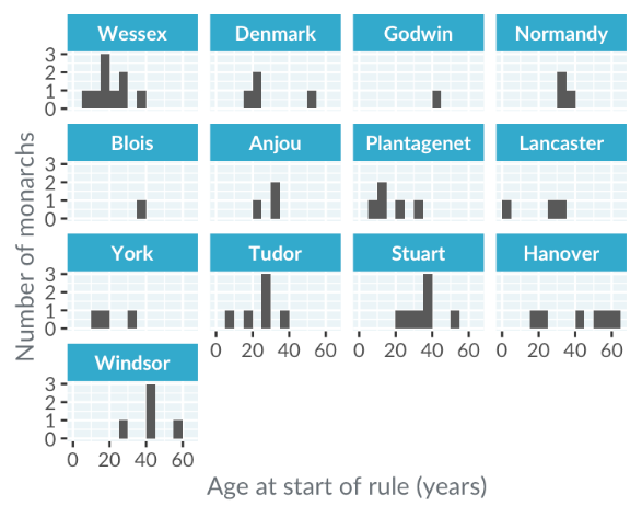
Limitations of Color-Coded Histograms
Let's use the same dataset on the Monarch ages. When visualizing the distribution of ages for different royal houses, simply coloring histograms for each house can result in a cluttered and confusing display. This method makes it difficult to discern patterns and compare distributions clearly.
A more effective approach is to create separate panels for each histogram, showing the distribution of ages by royal house. This allows for easier comparison of distributions within the same column but can still be challenging for comparing across columns.
While aligning panels in a single column helps with comparisons, it can lead to space issues and unreadable plots. To compare distributions between houses, such as York and Lancaster, viewers often need to do extensive back-and-forth looking, which isn't ideal.
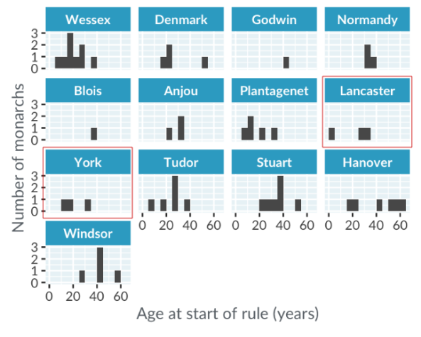
Fortunately, box plots can solve this problem.
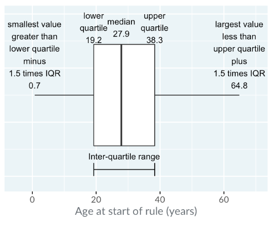
Box Plots
Box plots offer a more efficient way to compare distributions. They summarize the data by showing the median, quartiles, and outliers, making it easier to analyze and compare multiple distributions in a compact space.
-
Mid-line: Represents the median, with half the values above and half below.
-
Box: Extends from the lower quartile to the upper quartile. The inter-quartile range (IQR) is the difference between these quartiles.
-
Whiskers: Extend up to 1.5 times the IQR from the quartiles, or to the nearest data point within this range. Points beyond the whiskers are considered extreme values.
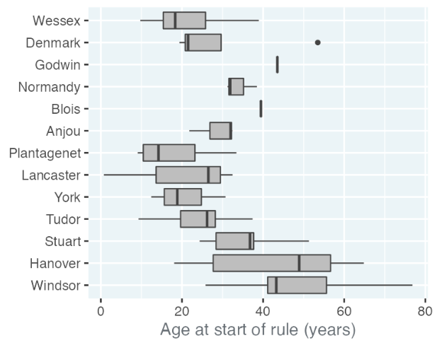
Case Study: Monarch Ages
In a box plot of royal houses from the Monarch ages data set from the previous sections, each house's box shows the median and quartiles of ages when monarchs ascended to the throne. The plot illustrates a trend of increasing ages over time since the Plantagenets, with some houses like Godwin and Blois having single data points. The house of Denmark has an outlier, Sweyn, who ascended unusually late at age 53.
Case Study: Cigarette Consumption
These box plots show cigarette consumption per person in the USA from 1985 to 1995, excluding Alaska and Hawaii. Each plot represents the average number of cigarette packs smoked per person per year in 48 states.
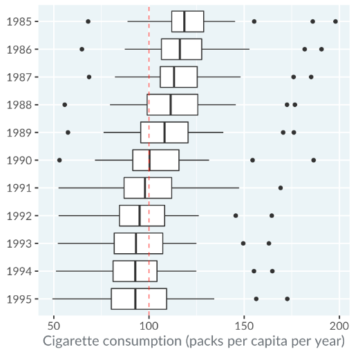
Reference: Stock, James H. and Mark W. Watson (2003)
Observations:
- In 1990, three states had extreme cigarette consumption per capita.
- The lower quartile of cigarette packs per capita decreased yearly from 1985 to 1995.
- The median consumption per capita was below 100 packs from 1991 onwards.