Scatter Plots
Scatter Plots
Scatter plots are ideal when you have two continuous variables and want to explore their relationship. For instance, does one variable increase as the other increases, or does it decrease?
Case Study: Los Angeles County Home Prices
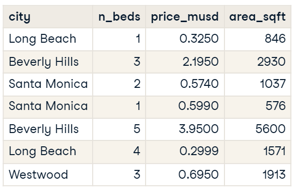
This dataset covers home prices in four cities within Los Angeles County for 2012, including details on the number of bedrooms, sale prices in millions of dollars, and area in square feet.
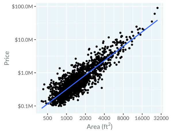
This scatter plot features price on the y-axis and area on the x-axis. Describing it verbally, you'd say it's a scatter plot of "price versus area".
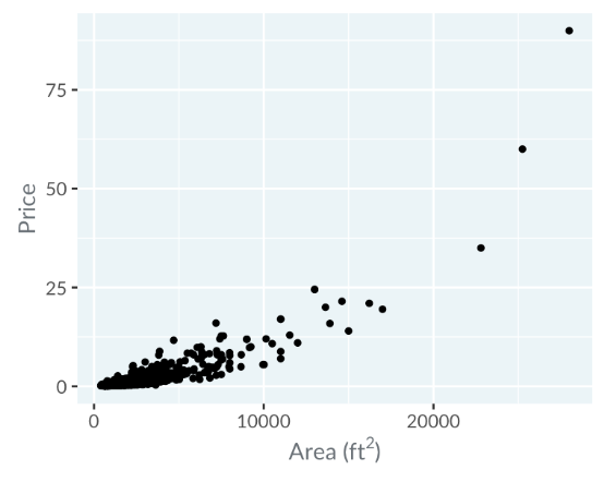
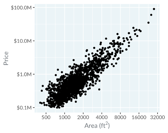
Initially, points cluster in the bottom left, making it hard to read. Switching to a logarithmic scale spreads points more evenly, where moving right doubles the area, and moving up multiplies the price by ten.
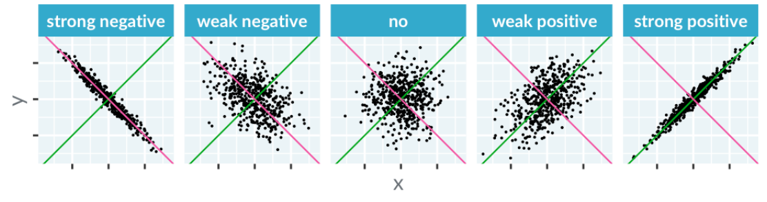
Correlation
Correlation measures how well you can draw a straight line through points.
- An upward line indicates positive correlation
- a downward line shows negative correlation
Examples include strong negative correlation (x increases, y decreases) and strong positive correlation (x and y both increase). Intermediate states show varying levels of correlation, including none.
Limitations of Correlation
Let's take a look at the Datasaurus Dozen again. This illustrates that datasets with identical correlations can look vastly different. Correlation works best with straight-line relationships between x and y.
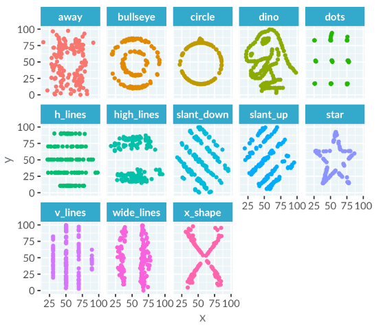
For complex shapes, describe the relationship creatively, such as "the plot looks like a dinosaur" instead of "x and y have a slight negative correlation".
Trend Lines
Straight lines on scatter plots help identify linear relationships between x and y variables. For example, with logarithmic scales, a trend line closely fitting the points indicates a linear relationship between the logarithms of area and price.
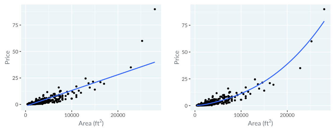
Using Smooth Trend Lines
When a straight trend line poorly fits, such as missing more expensive homes on a price vs. area plot using a linear scale, a curved trend line can better represent the relationship. A curve showing the trend line arching upwards suggests that as the area increases, the price increases faster than linearly.