Getting Insights
Overview
There are three primary methods for deriving insights from a dataset. Each method has its unique advantages, and they are often used together.
- Calculate summary statistics like mean, median, and standard deviation
- Run statistical models such as linear and logistic regression
- Visualize data with plots like scatter plots or histograms
The Datasaurus Dozen
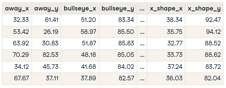
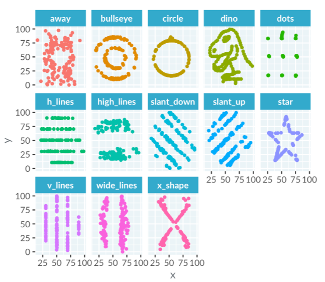
The Datasaurus Dozen is a collection of 13 datasets, each with x and y coordinates. These datasets illustrate the importance of visualizing data.
-
The term "variable" refers to a column of data
-
Examples include datasets named "away" and "bullseye"
When calculating the mean of the x values in each dataset, you’ll find similar values across the datasets. This similarity extends to the y coordinates, with means being nearly identical across datasets.
- The variation of the x and y values is measured by standard deviation
- The variation is also the same for each dataset.
- Standard deviation describes how spread out the values are
Visualizing the datasets reveals differences that calculations alone miss. Scatter plots of each dataset show distinct patterns. The datasets, including lines, circles, a star, and a dinosaur, emphasize the importance of plotting data.
Continuous and Categorical Variables
Different types of data require different types of plots. Choosing the right plot depends on whether your variables are continuous or categorical.
-
Continuous variables
- Numbers like heights, temperatures, and revenues
- Arithmetic operations can be performed on them
-
Categorical variables
- Text-based classifications like eye color, country, and industry
Some variables can be treated as either continuous or categorical, depending on the context.
- Age: A number (continuous) but often grouped in surveys (categorical)
- Time: Naturally continuous but can be categorized (e.g., months in a report)
The choice depends on the specific question you’re trying to answer.