Create Visualizations
Updated May 17, 2024 ·
Overview
Tableau makes it easy to turn data into interactive charts and graphs.
- Drag and Drop – Move fields onto the canvas to create visuals
- Choose Chart Types – Select bar charts, line graphs, maps, and more
- Customize – Adjust colors, labels, and tooltips for better insights
Choosing Charts
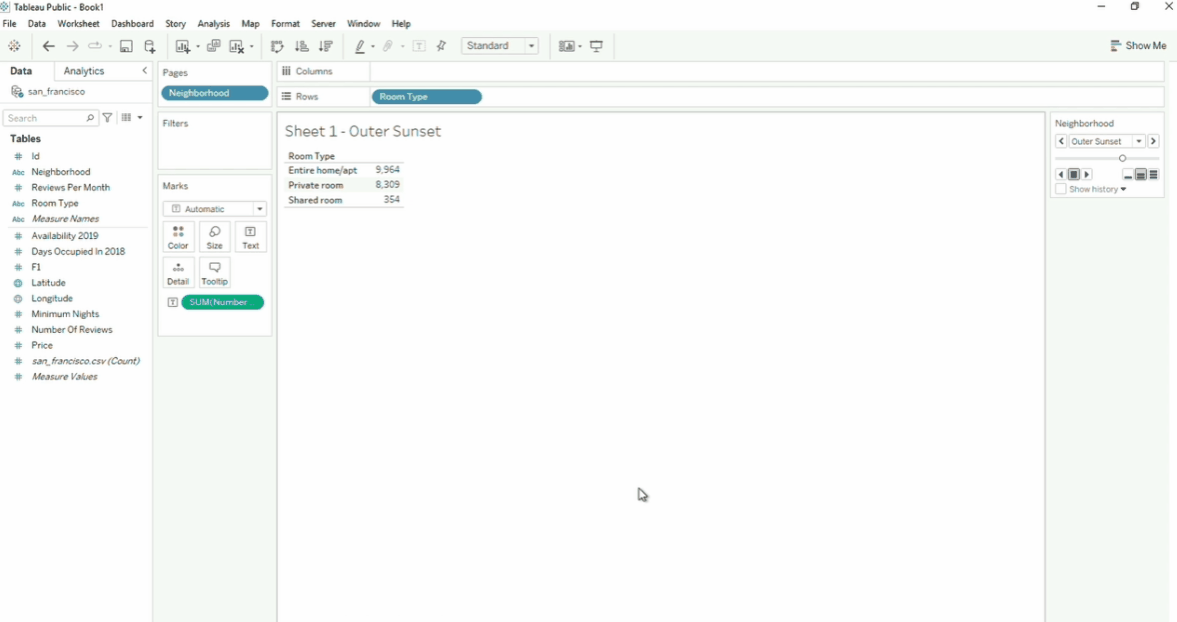
In the example below, we have a workbook that's already loaded. Clicking the Show me button at the top right will display the visualizations options. When you select the a chart, the fields in the Pages shelf will disappear and a new shelf containing the color legends will appear on the right.
- You can also select other charts such as a pie chart, box plots, etc.
- For box plots, you can view values such as median by hovering over the plots.
- For box plots, the box that appears when you hover over the plots is called tooltips
- To print the actual values without hovering over, click the Show Mark Labels button.