Visualizing Dates
Overview
Dates help analyze when events happened and identify trends over time. Tableau makes it easy to work with dates in visualizations.
-
Date Fields in Tableau
-
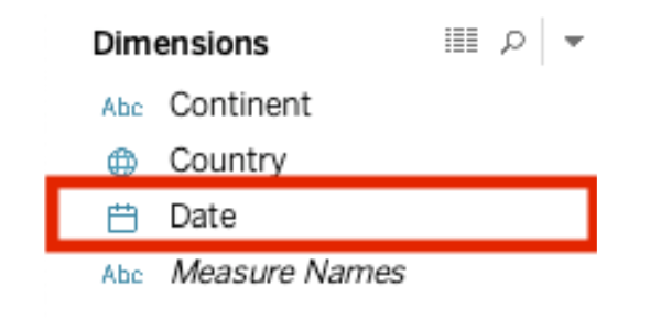
Dates are stored in the Dimensions area.
-
Identified by a calendar icon in the Data pane.
-
-
Built-in Date Hierarchy
- Tableau allows drilling down from Year ➔ Quarter ➔ Month ➔ Day.
- Helps analyze trends at different levels.
Setting Up the Visualization
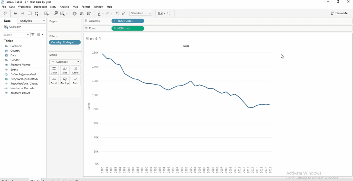
In this example, we’ll use a dataset from the United Nations Statistics Division to visualize the trend of births in a country over the years.
Download the workbook here: 3_1_UN_stats_yearly_data.twbx
Let's start with creating the line chart to see the trends.
-
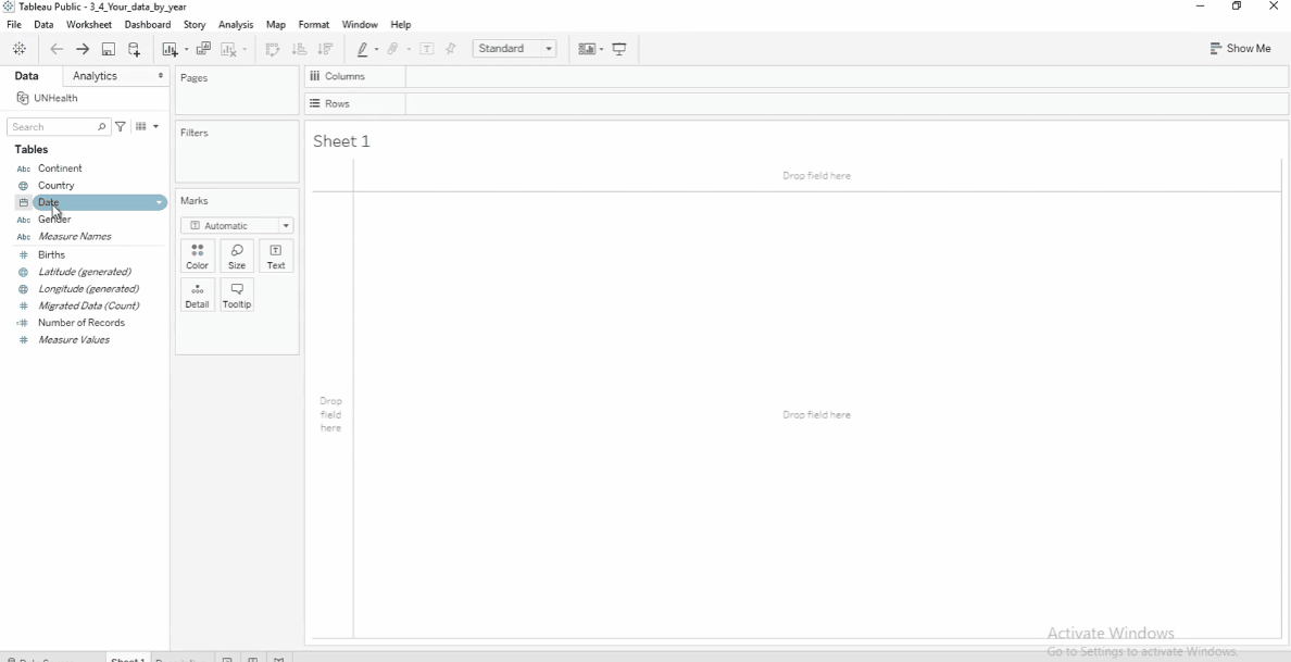
Drag Date to Columns.
-
Drag Births to Rows.
-
Drag Country to Filters and select a country (e.g., Portugal).
-
Tableau automatically groups data by Year.
Adjust the Granularity
Using the previous dataset, we can modify it to adjust the granularity:
-
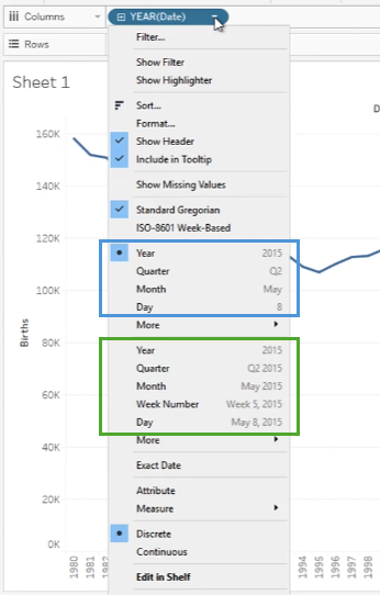
Click the arrow next to YEAR(Date) and select Month.
-
There are two sections here: discrete (blue) and continuous (green).
-
If months appear without years, Tableau is treating them as a discrete dimension (blue).
-
To show a timeline, select Month from the second section in the dropdown.
-
This makes it a continuous measure (green), displaying each month in each year.