Sharing Insights
Story Points
Story Points provide a flexible way to present data while staying connected to live data. This allows real-time answers to stakeholder questions, reduces delays, and improves decision-making.
Structuring Your Presentation
-
State the Main Question
- Clearly define what you're analyzing or solving.
- Example: "What factors influence customer churn?"
-
Provide Context & Data Assumptions
- Explain the available data and any limitations.
- Example: "Data covers the last 12 months, excluding incomplete records."
-
Share Insights & Recommendations
- Present key findings with supporting observations.
- Example: "Churn rates are highest among users with inactive support tickets."
Story Points Tools
-
Formatting
- Adjust colors, shading, and branding for clarity.
- Example: Add company logos or consistent color schemes.
-
Local Annotations
- Add text comments to highlight key insights.
- Example: "Revenue dip in Q2 due to supply chain issues."
-
Tooltips & Additional Features
- Use interactive elements like tooltips to provide extra details.
- Example: Hover over a bar chart to see exact sales numbers.
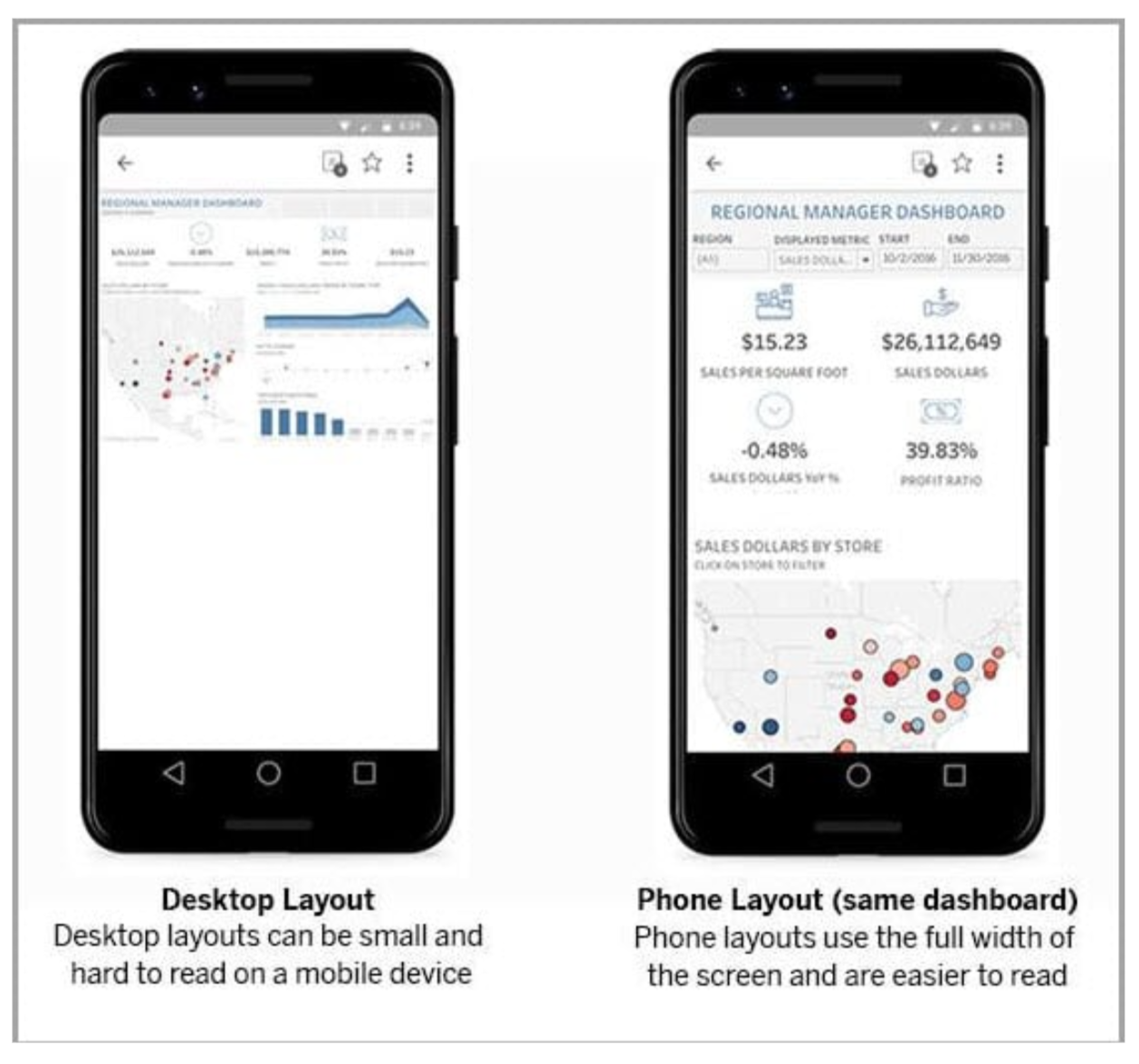
Sharing on Mobile
Dashboards can be shared via the Tableau mobile app or exported in different formats. If users view reports on mobile devices, the layout should be adjusted for small screens to ensure readability and clarity.
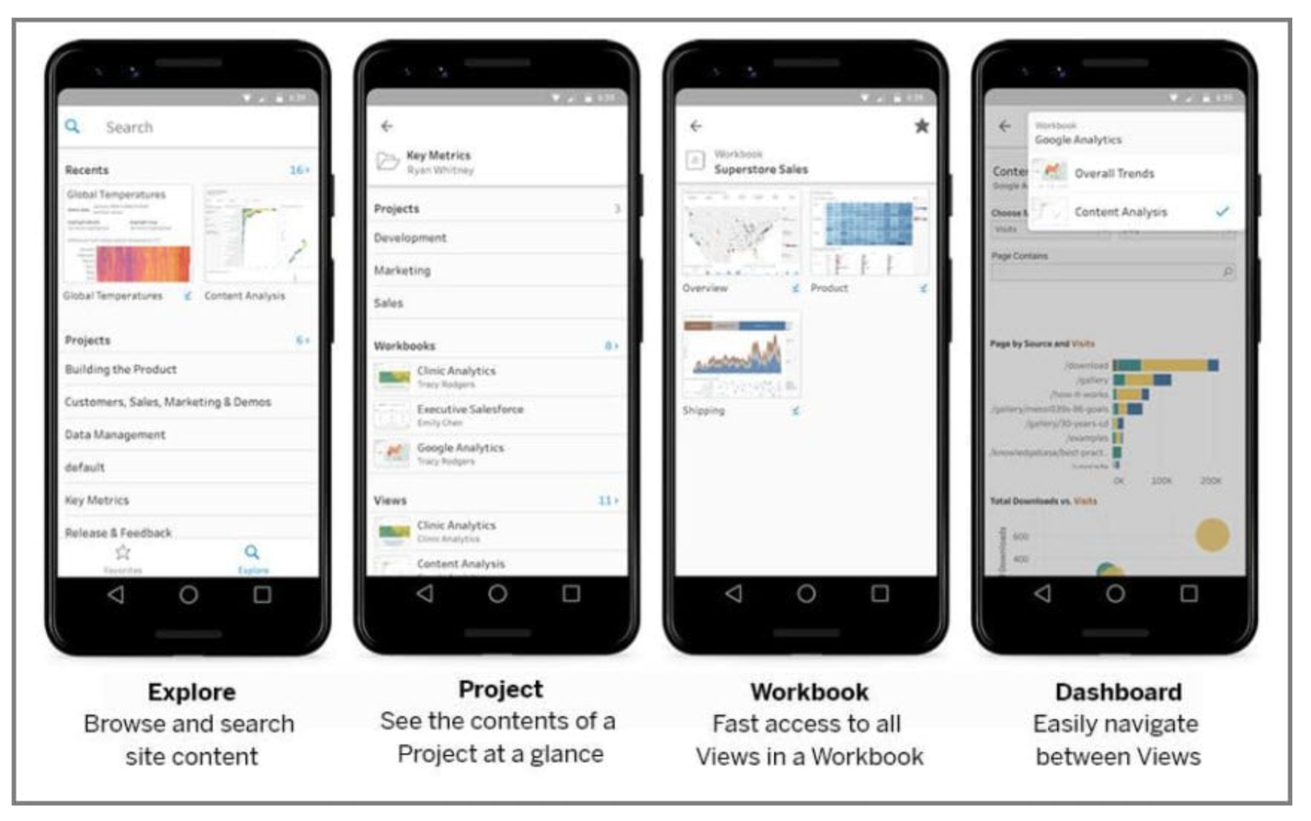
The app makes it easy to access data with sections like:
- Favorites & Recents – Quick access to frequently used dashboards.
- Explore & Projects – Browse available reports.
- Workbook & Sheet Selector – Navigate reports efficiently.
To optimize visualizations for mobile, you can preview and adjust layouts accordingly.
Customize for Mobile Devices
Tableau allows you to adjust visualizations for specific devices like phones and tablets. By default, Tableau generates a Phone layout automatically.
To hide a part of the visualization in mobile view, right-click the item and select Remove Zone from Phone.
Adding Navigation
Navigation buttons make it easy to switch between dashboards, especially on mobile devices.
Example: Adding Navigation to the Incident Dashboard
In this example, we have an workbook that has an Incident, Requests, and Problems dashboard. The incident dashboard needs to have a button that will allow the user to navigate to the other dashboards.
Download the workbook here:
Steps
- Drag the Navigation object from the Objects panel.
- Set the following for the Requests button:
- Navigate to: Requests
- Title: Go to Requests
- Background: Light Blue
- Tooltip: Tap to go to Requests
- Add another navigation button for Problems:
- Navigate to: Problems
- Title: Go to Problems
- Background: Light Green
- Tooltip: Tap to go to Problems
- Click Presentation Mode in the toolbar.
- Preview and test the navigation.
Solution
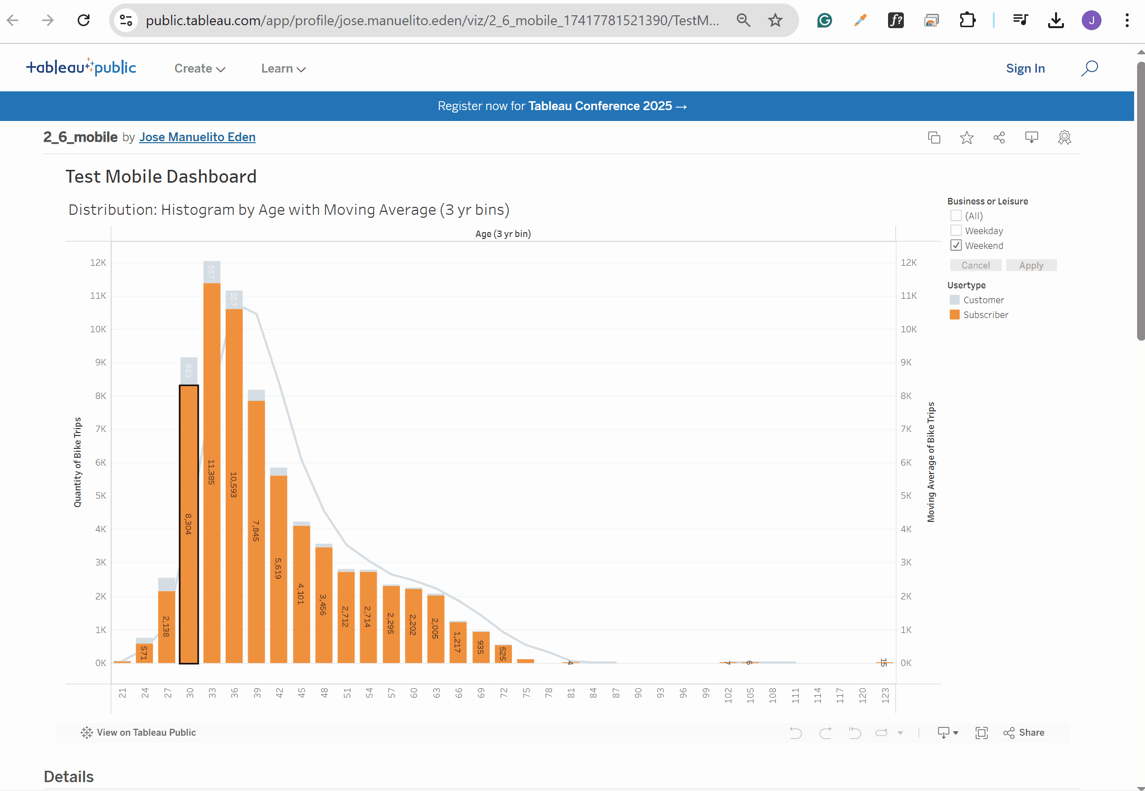
Exporting Visualizations
You can export your Tableau visualizations in different formats:
- Images – PNG, JPG, or BMP
- Documents – PowerPoint or PDF
- Sharing – Publish to a private or public server
Note that exporting image is only available from Tableau Desktop, not Tableau Public.
- Go to Dashboard.
- Click Export Image
You can still export images from Tableau Public, but it requires a slightly different process than with Tableau Desktop.
-
On Tableau Public, go to File > Save to Tableau Public.
-
YOu'll be prompted to sign-in with an account.
-
After publishing, you can access the "Download" button at the bottom.